Sid Mehta Works
Naavo

Naavo

Project details

Role

Solo

Duration

8 weeks

Year

2020

Tools

Illustrator

Client

Self Initiated

Project highlights

8 weeks

identity to packaging

3

brand · logo · packaging

Solo

concept & visual system

Overview

Built an Ayurveda brand end to end, identity through packaging, in eight weeks, landing on a calm and grounded visual language that avoids both clinical and nostalgic clichés.

Branding · PackagingSolo · Self Initiated
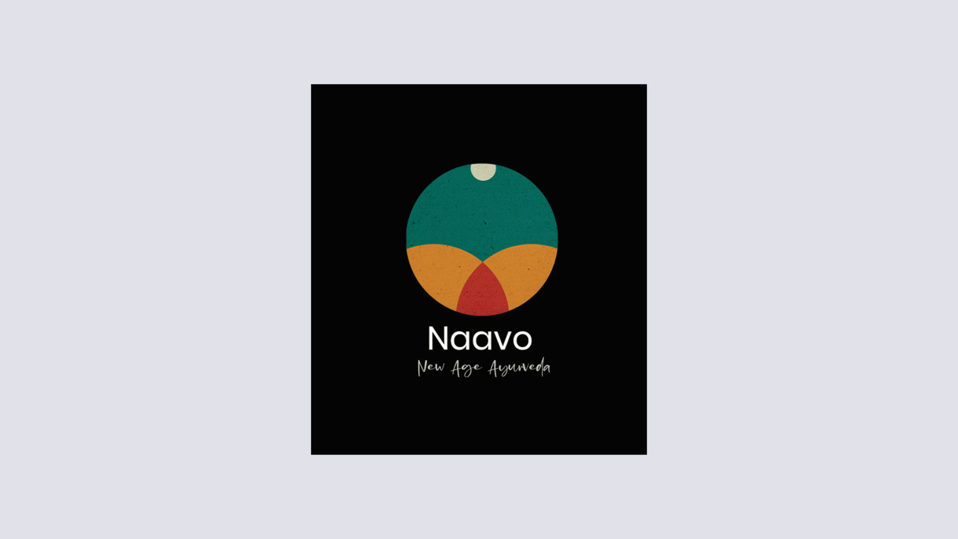
The Naavo identity: New Age Ayurveda, set under a mark of three coloured segments in a circle
Dosha explained: five elements combine into three doshas, Vata as ether and air, Pitta as fire and water, Kapha as earth and water
Five elements, three doshas, one you, shown as leaf, fire, night sky, cloud and water

Ideation.

Handwritten research map connecting Ayurveda, the three doshas, diet and lifestyle
Logo development: the five elements reduced to overlapping circles, with sketch exploration and the dosha colour set
Positioning: where Naavo sits against other brands on authenticity and price

Logo breakdown.

Construction of the mark on a grid, and the three doshas combining into the human

Making simple shapes out of the dosha patterns.

Mobile app to purchase guided products.

App screens: the Prakriti test, a user profile with dosha results, the splash, a recommended shelf and a product page
Inside a Naavo store, with a planted wall behind the counter

Naavo packaging labels.

The in-store dosha test on a kiosk, and how the product range differentiates by dosha
Face and body oils on a plinth, beside a printed hang tag
The oil range in five variants

Product mock-up.

Massage oil cartons in kraft board
A Vata massage oil box

Product incense sticks.

Vata lavender mint incense sticks, laid out with herbs and a mortar
Incense packaging opened, showing the inner sleeve
Kapha nagachampa incense sticks, with tuberose and a bowl of herbs
The three incense variants together, one for each dosha

Creams and oils.

Hydrating sea salt crystal rose body polisher
Morning dew face serum, photographed among ferns and moss

Branding collaterals.

A Naavo tote carried through foliage
A branded t-shirt and a woven care tag
The Naavo yoga mat, seen from above in child pose
Stationery: letterhead, business cards and envelope

Instagram posts and stories.

The Instagram profile, a product post and a carousel

Potential advertisements.

Street posters pasted on a wall and in a shopfront: five elements, three doshas, one you
A lit billboard at night: discover your dosha today
Reflection

This project taught me how much restraint branding requires. It was easy to lean too heavily into traditional visuals or make it feel too modern and lose its essence. Finding that balance meant being intentional with every element, color, form, and typography.

I started thinking more carefully about packaging as a physical encounter. How it sits in someone’s hand, how it reads from three feet away on a shelf, and what it says before anyone reads the label.
Back to top
Next project Mool The majority of Indians deserve a better shot at money and a source that empowers them ... Back to top