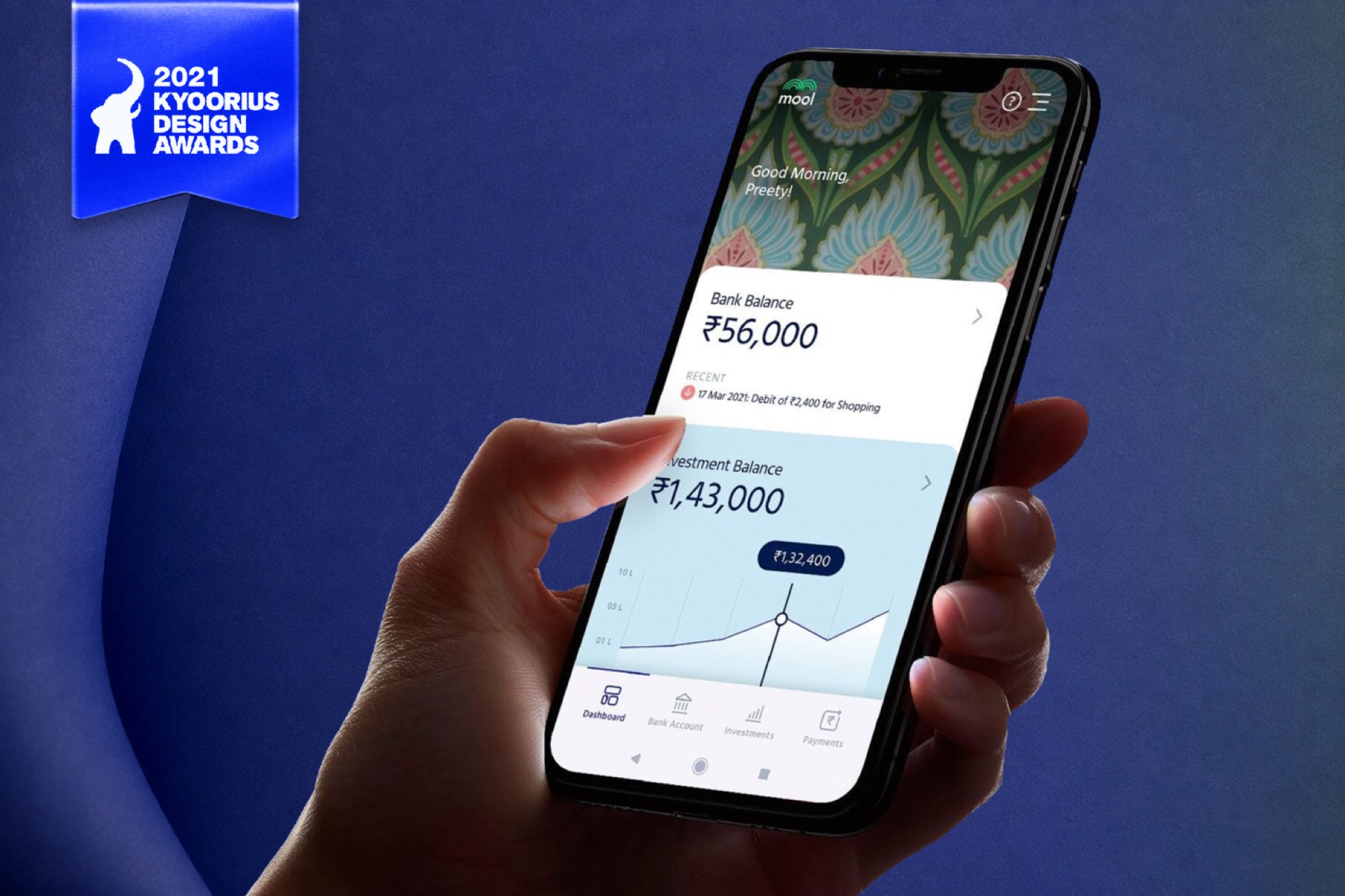
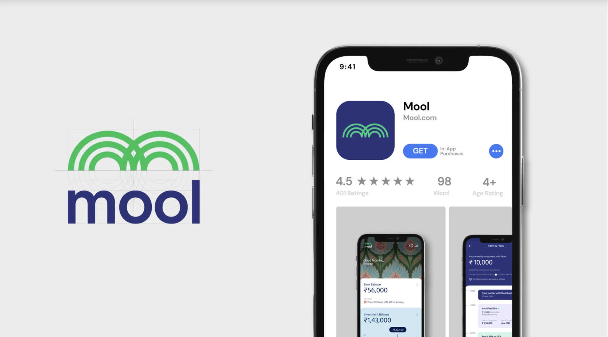
Mool
Project details
Project highlights
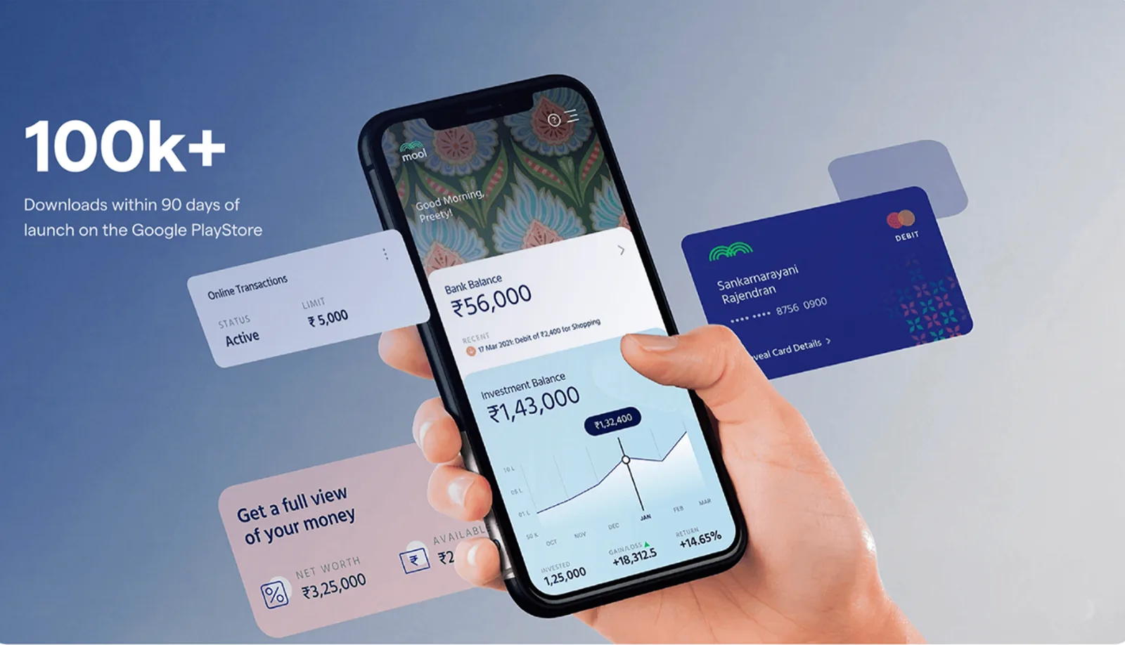
100k+
downloads
6 months
design timeline
Kyoorius
Design Award · 2021
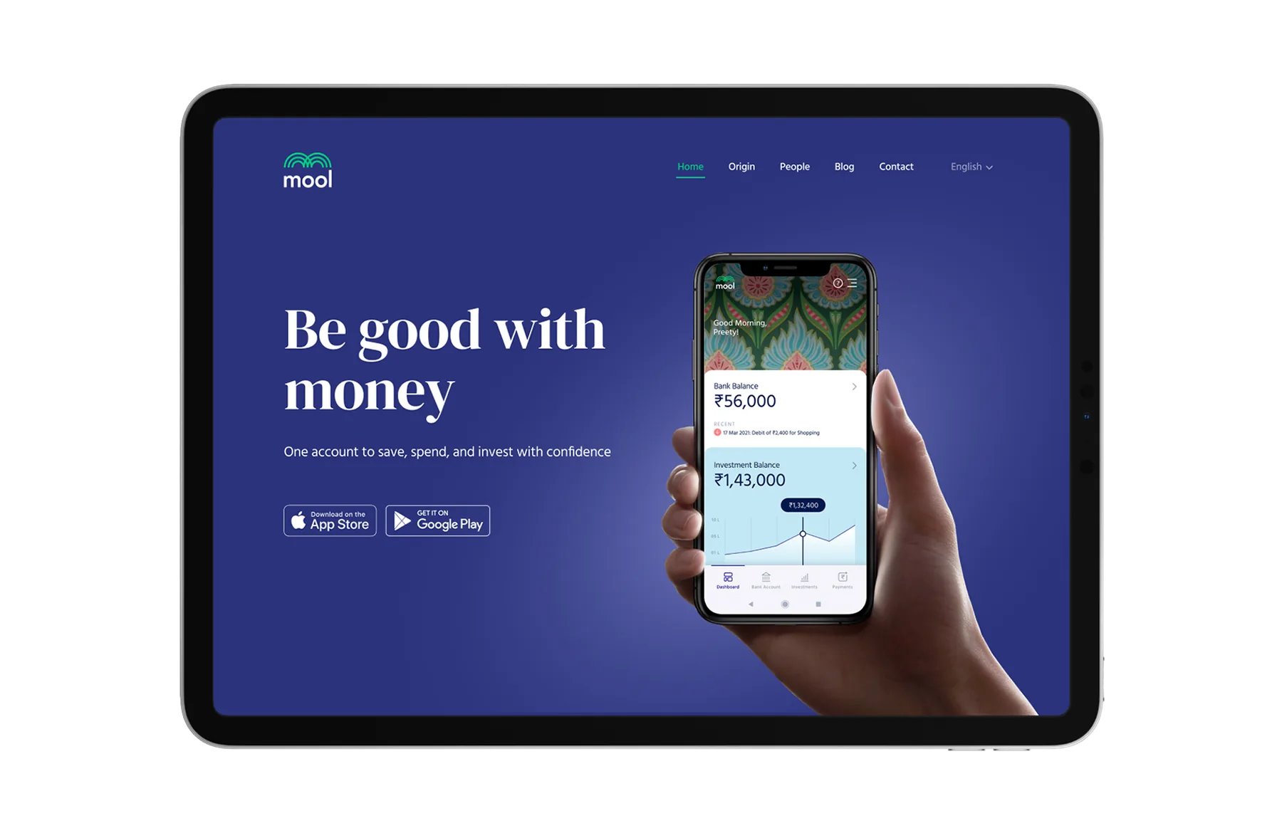
Led visual design for a neo-banking product that made everyday financial tools feel familiar and trustworthy for underserved communities across India.
UI · FintechVisual Designer
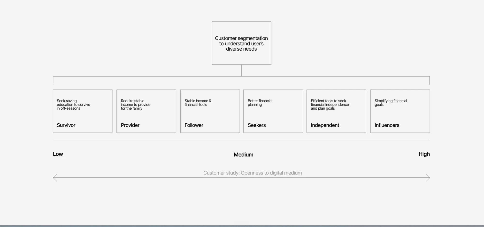
Research
Customer segmentation to understand the diverse needs of users across the income spectrum.
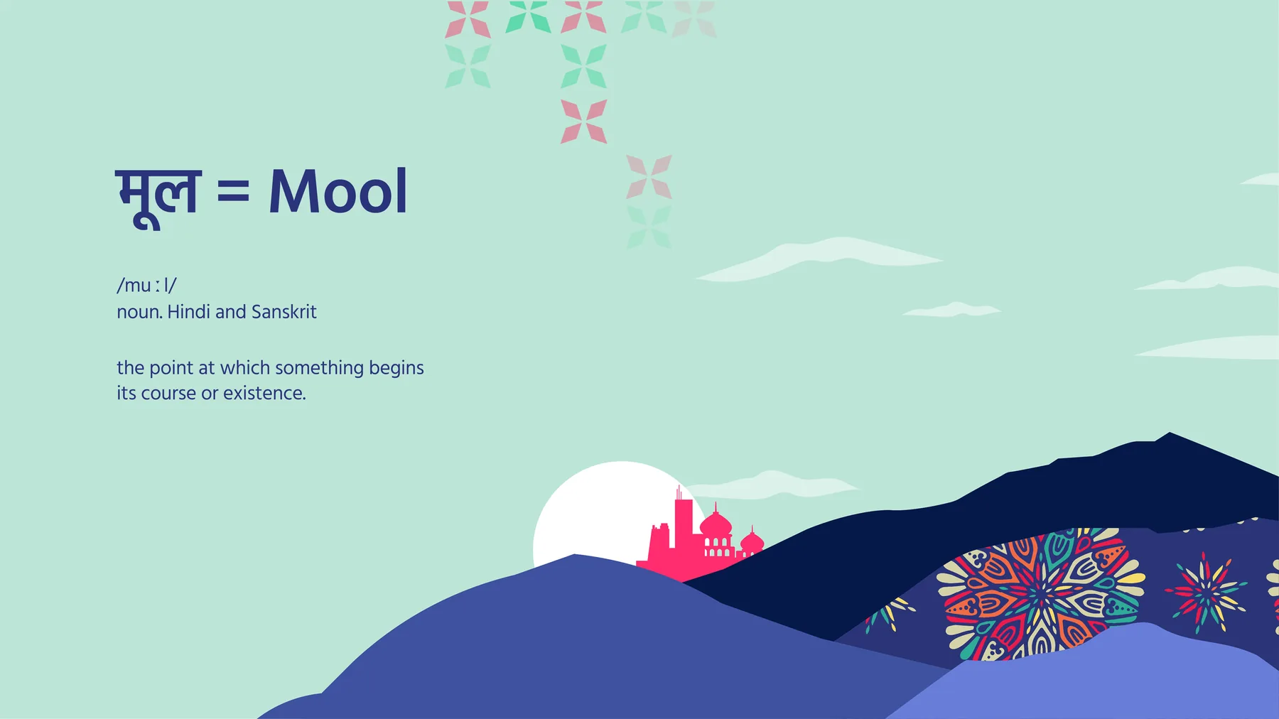
The brand
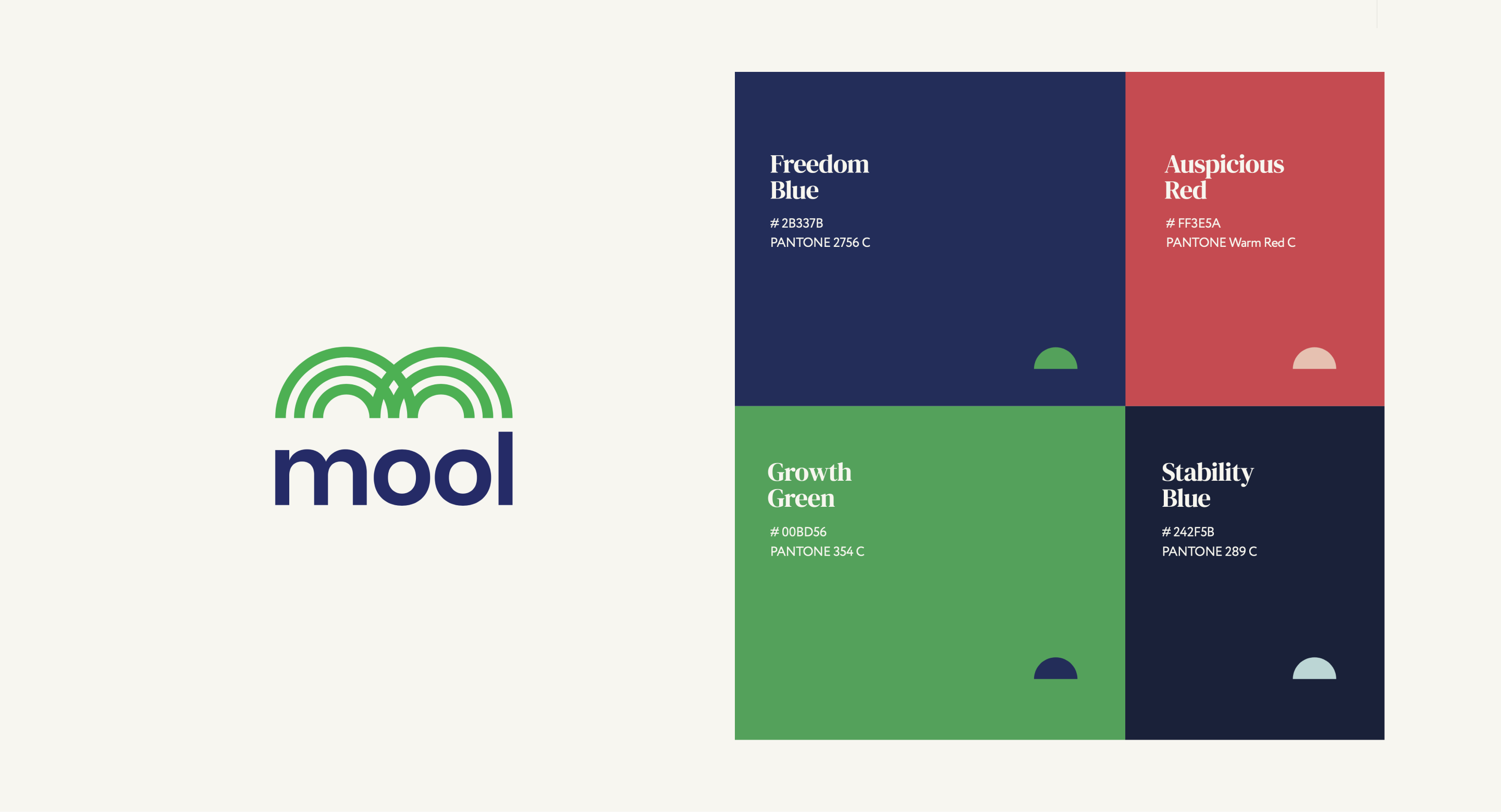
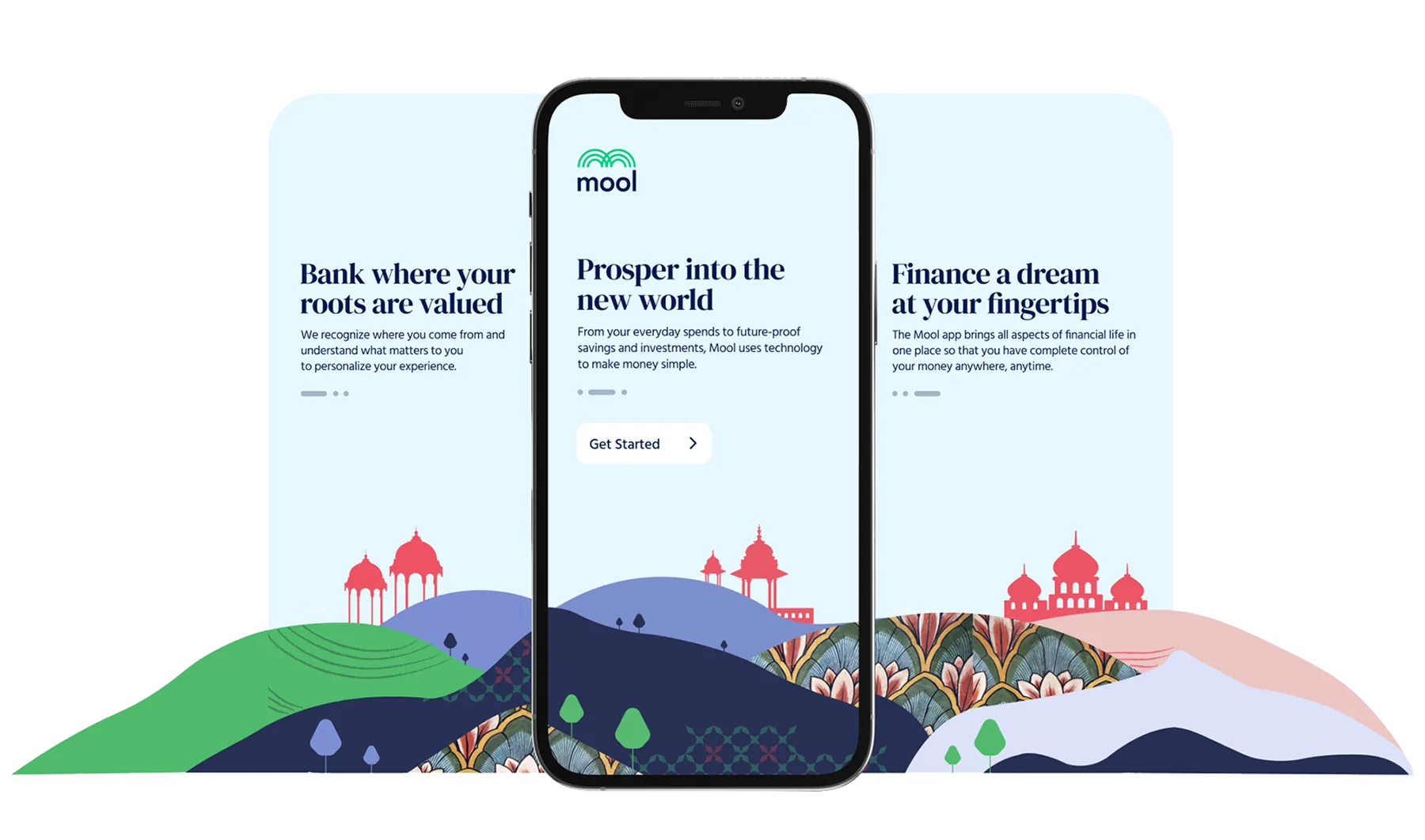
Mool is the Sanskrit and Hindi word for the point at which something begins. Four colours, each named for what it signals rather than what it is.
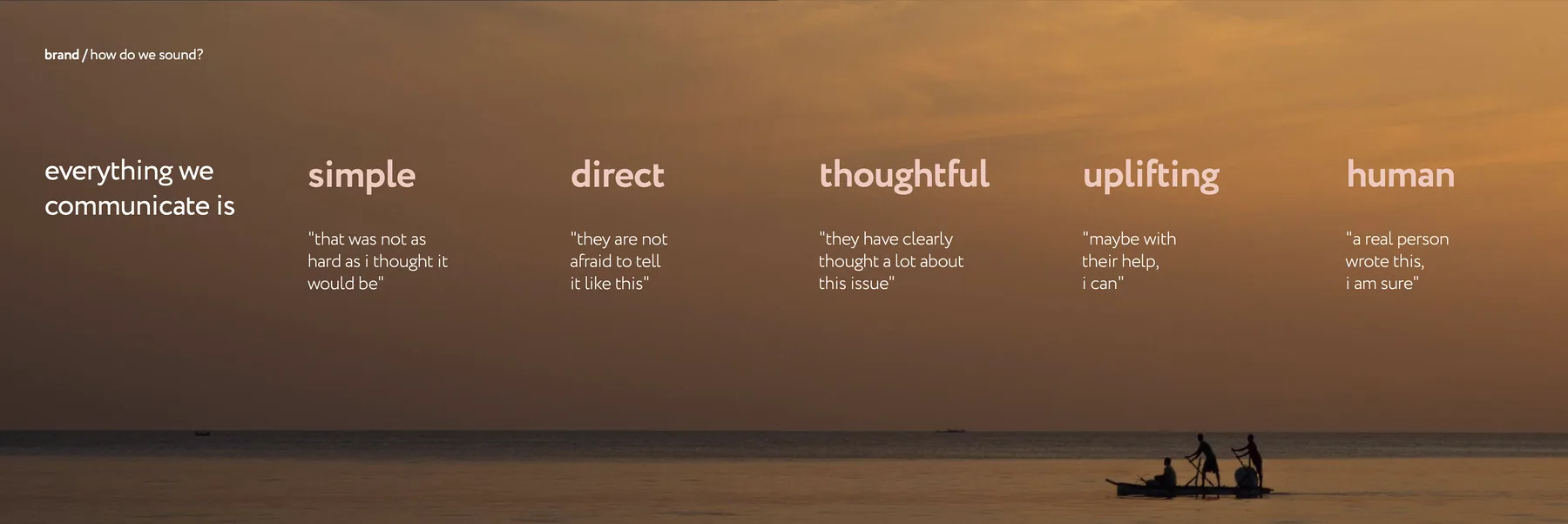
Tone of voice: simple, direct, thoughtful, uplifting, human.
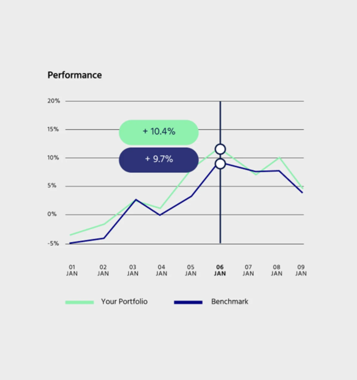
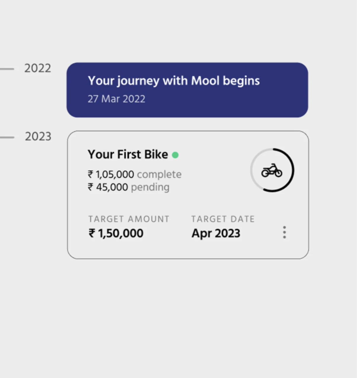
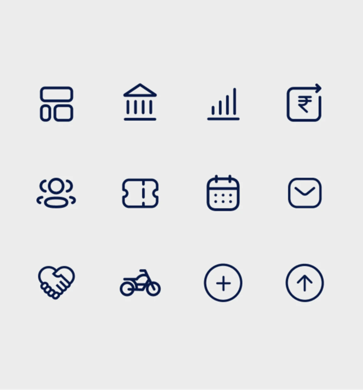
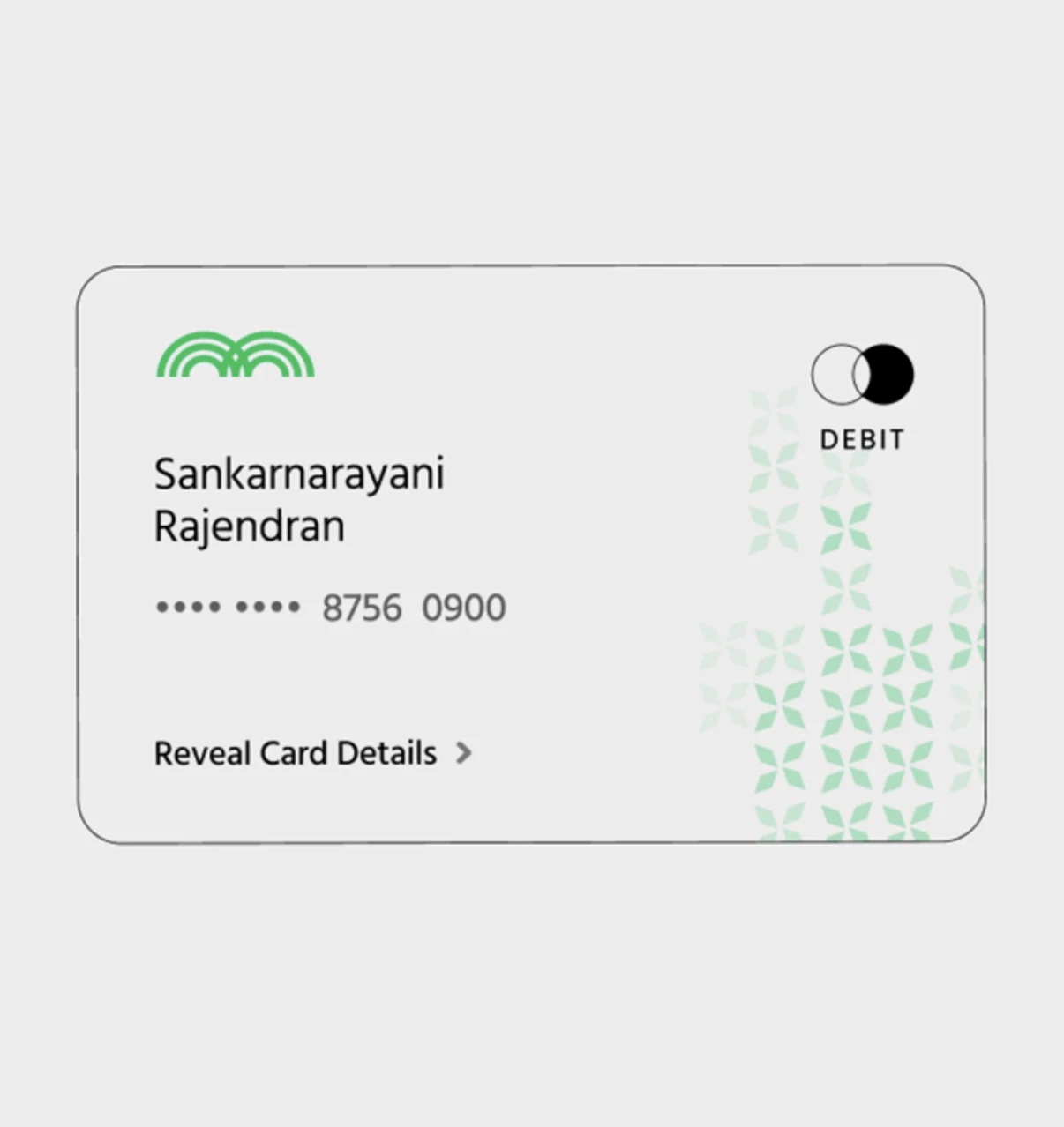
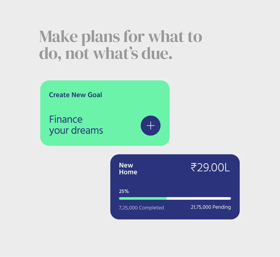
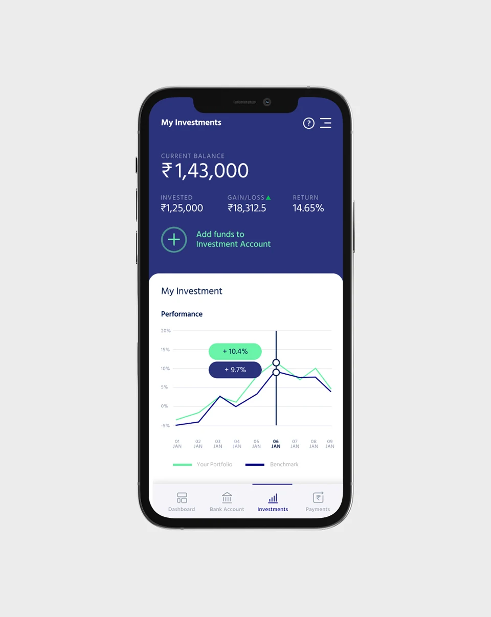
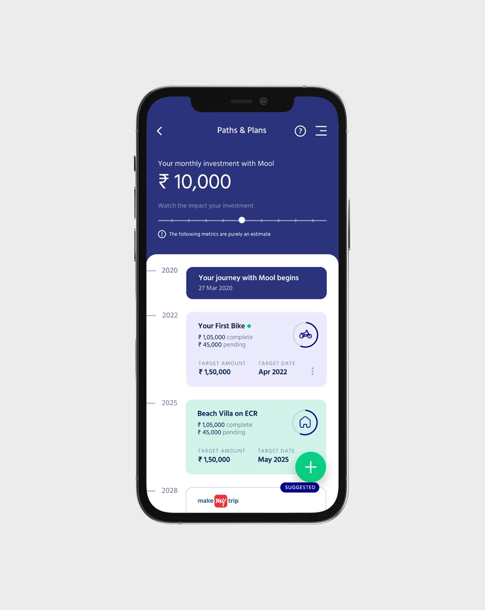
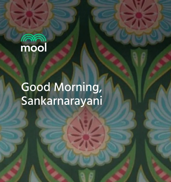
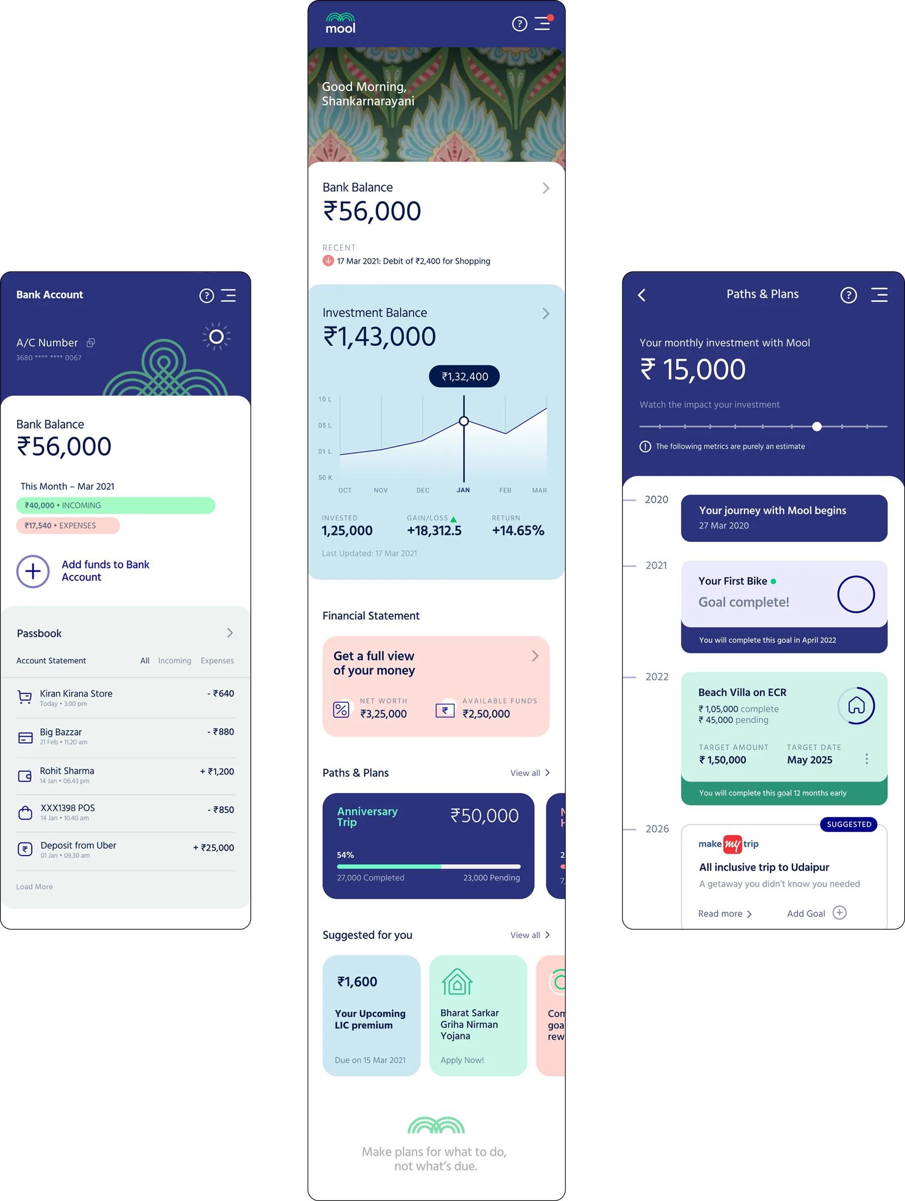
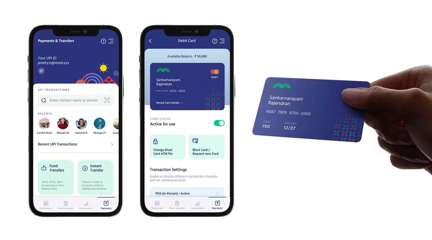
Little design decisions along the way: the performance chart, the splash quote, a goal timeline card, the icon set, the debit card.
The product
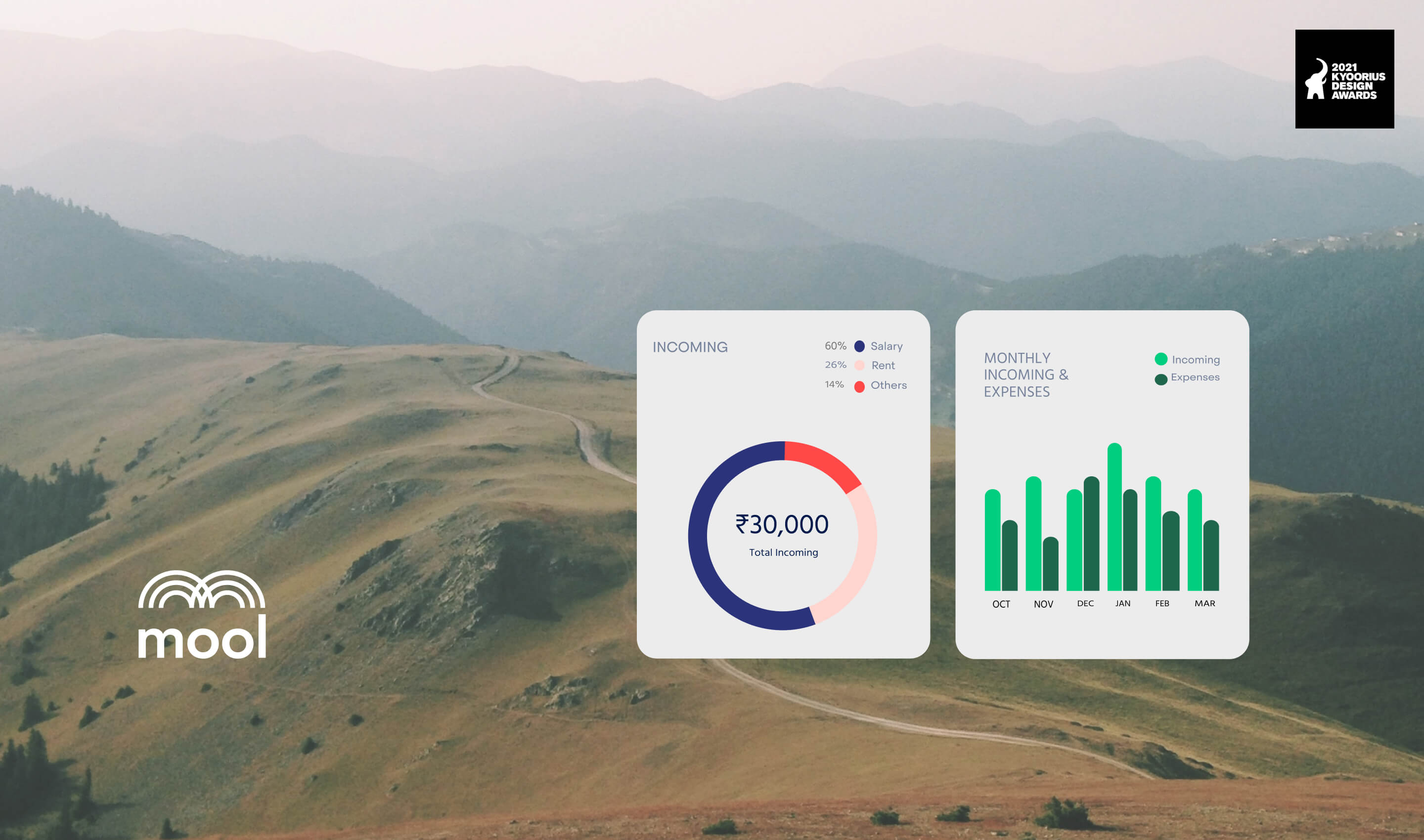
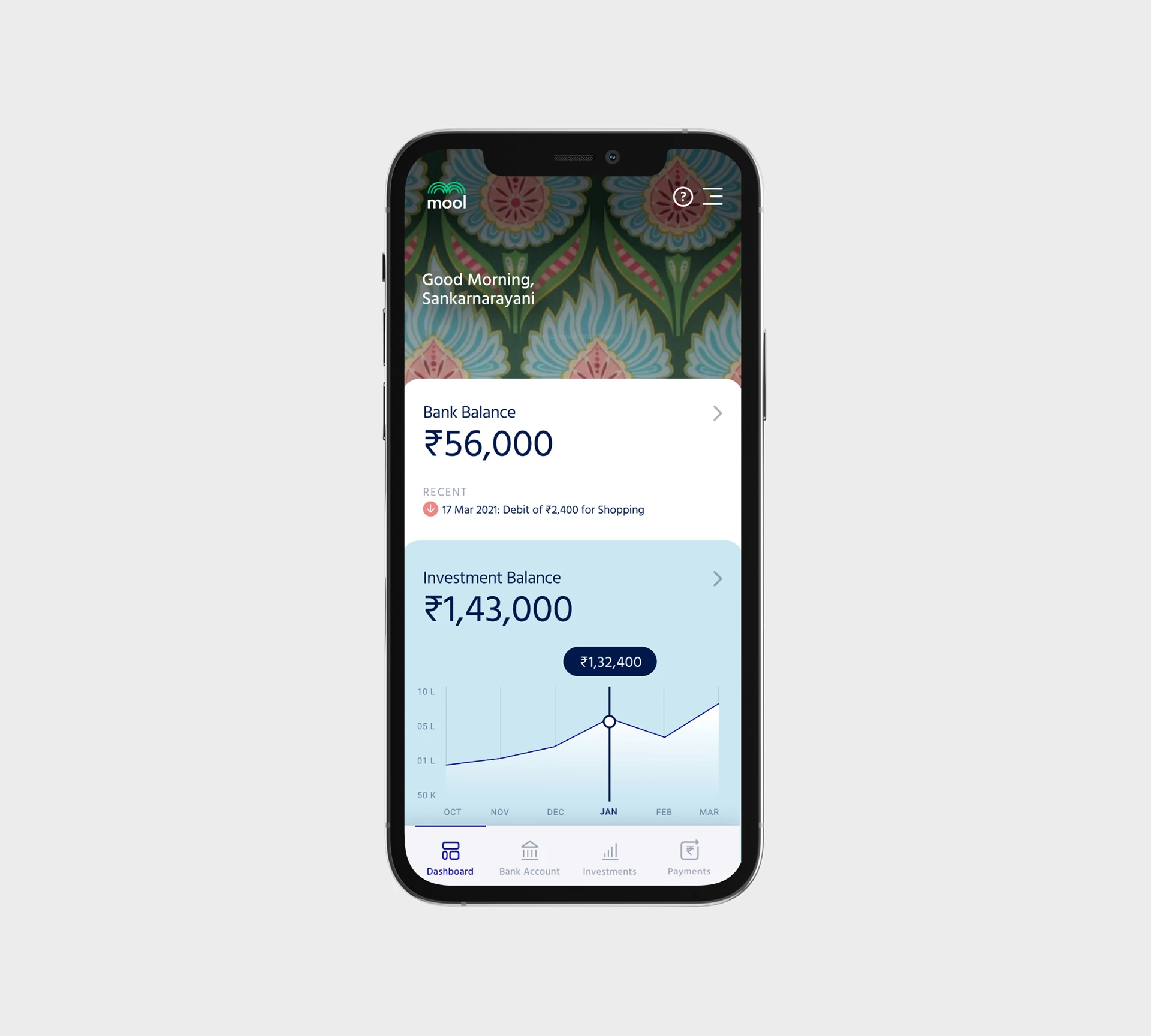
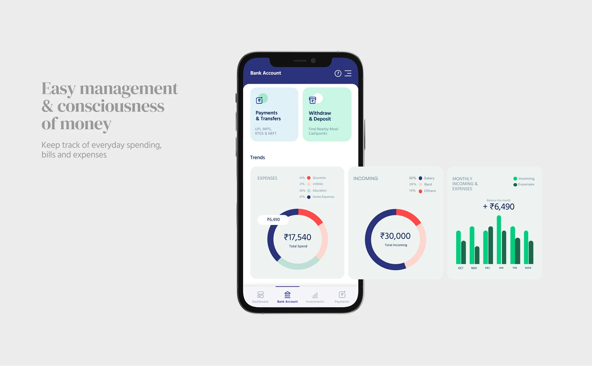
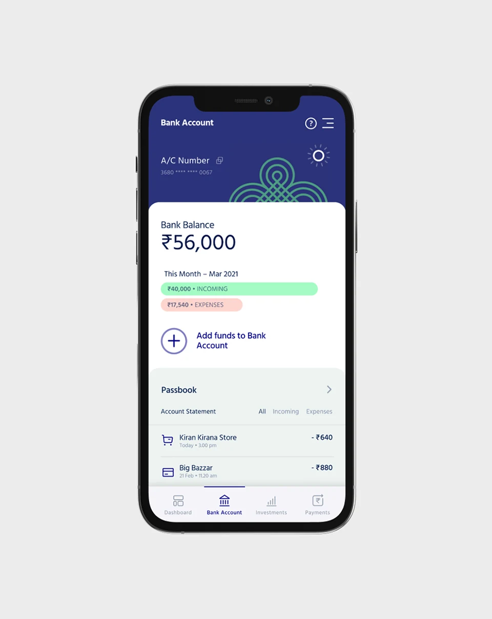
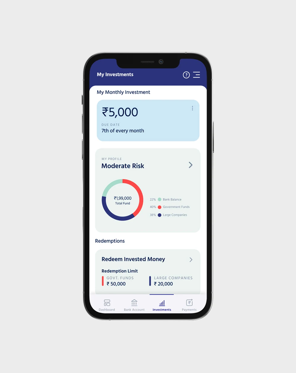
Easy management and consciousness of money: keep track of everyday spending, bills and expenses.
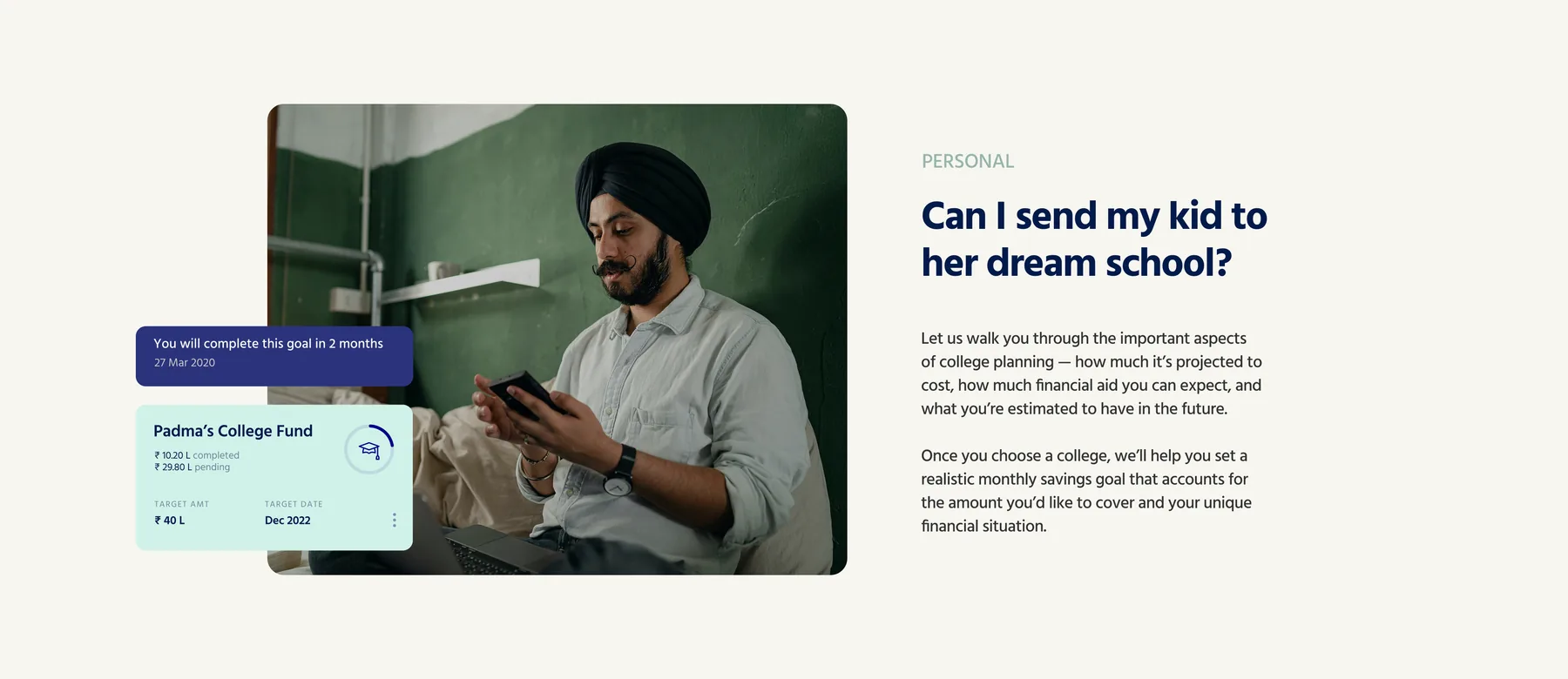
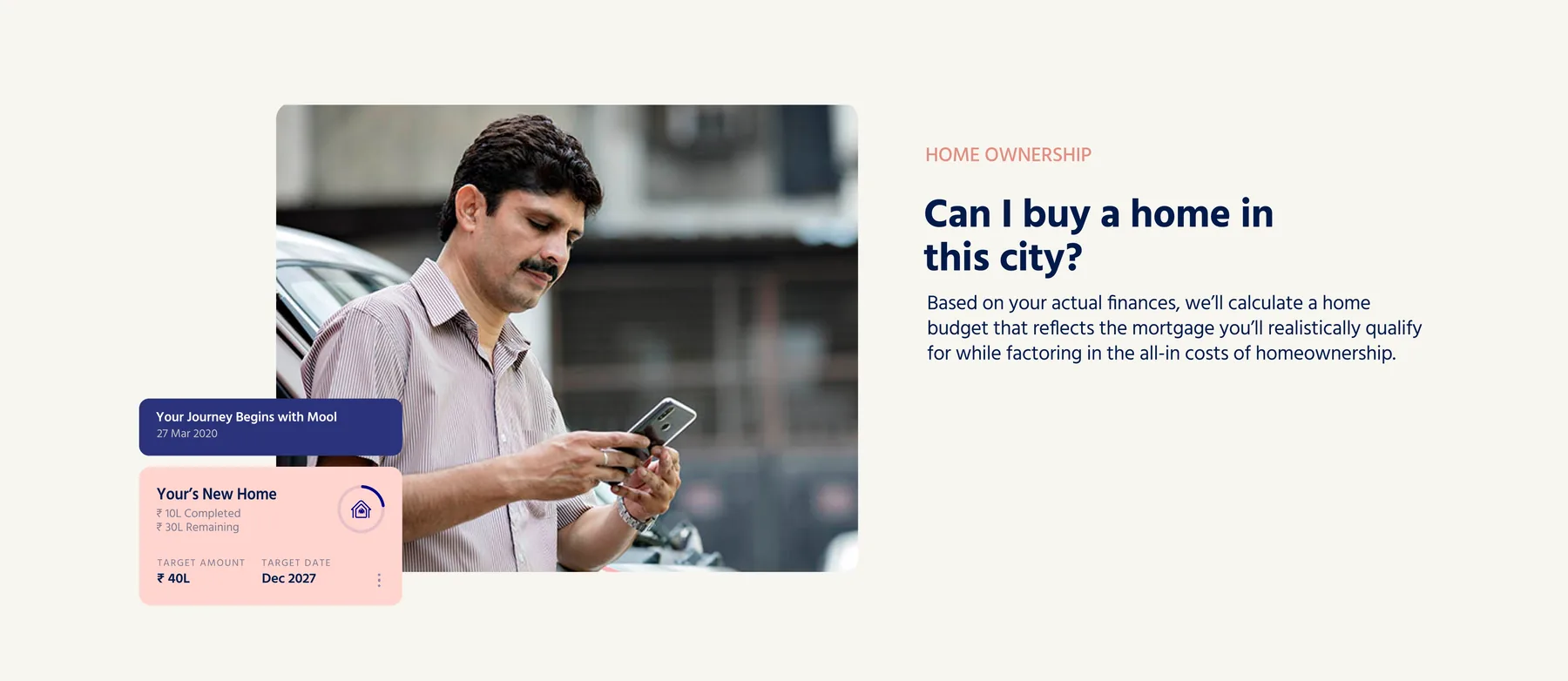
Goals are written as questions, in the words people already use for them. Can I send my kid to her dream school.
Out in the world
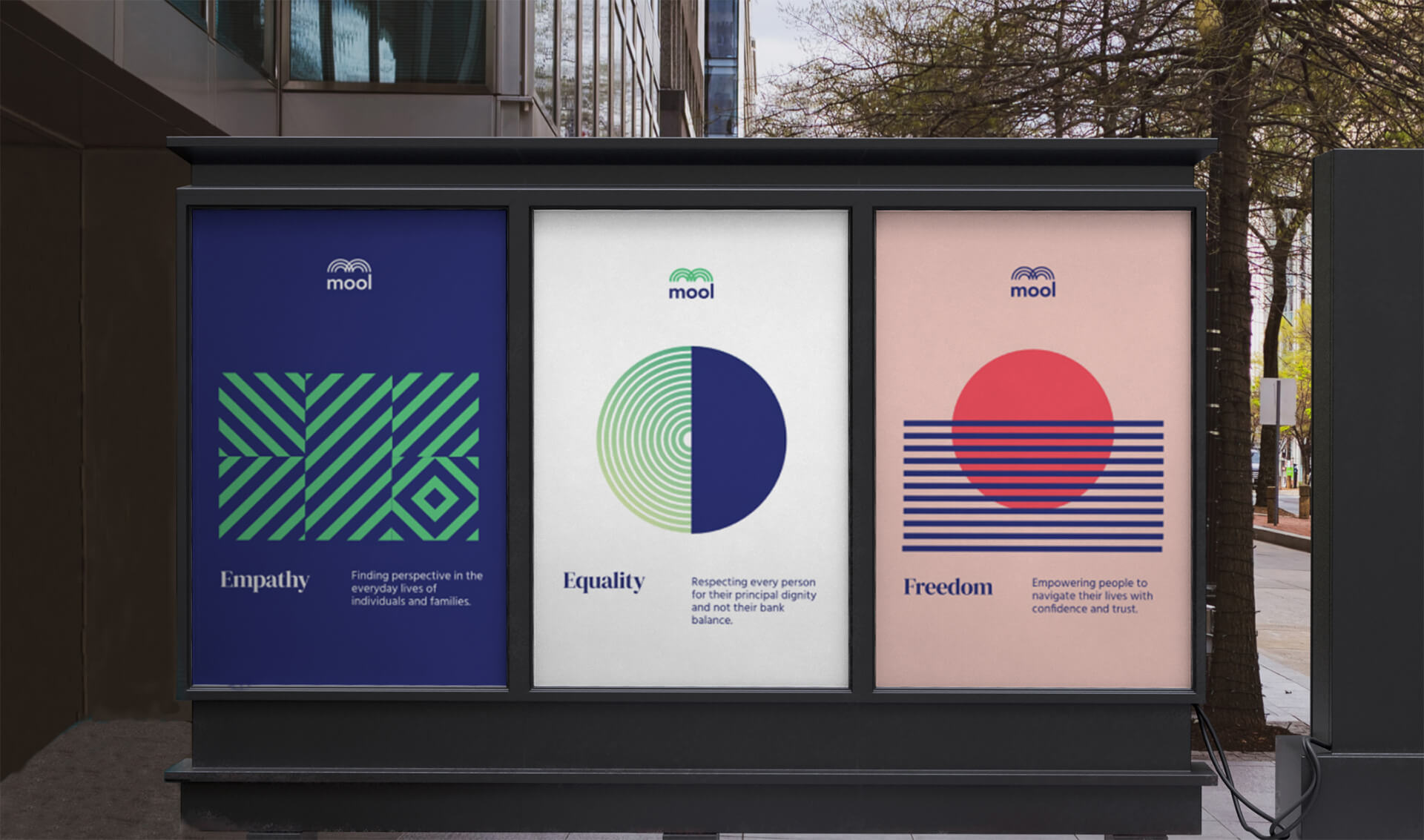
Out of home, the brand argues for three words rather than a product: Empathy, Equality, Freedom.
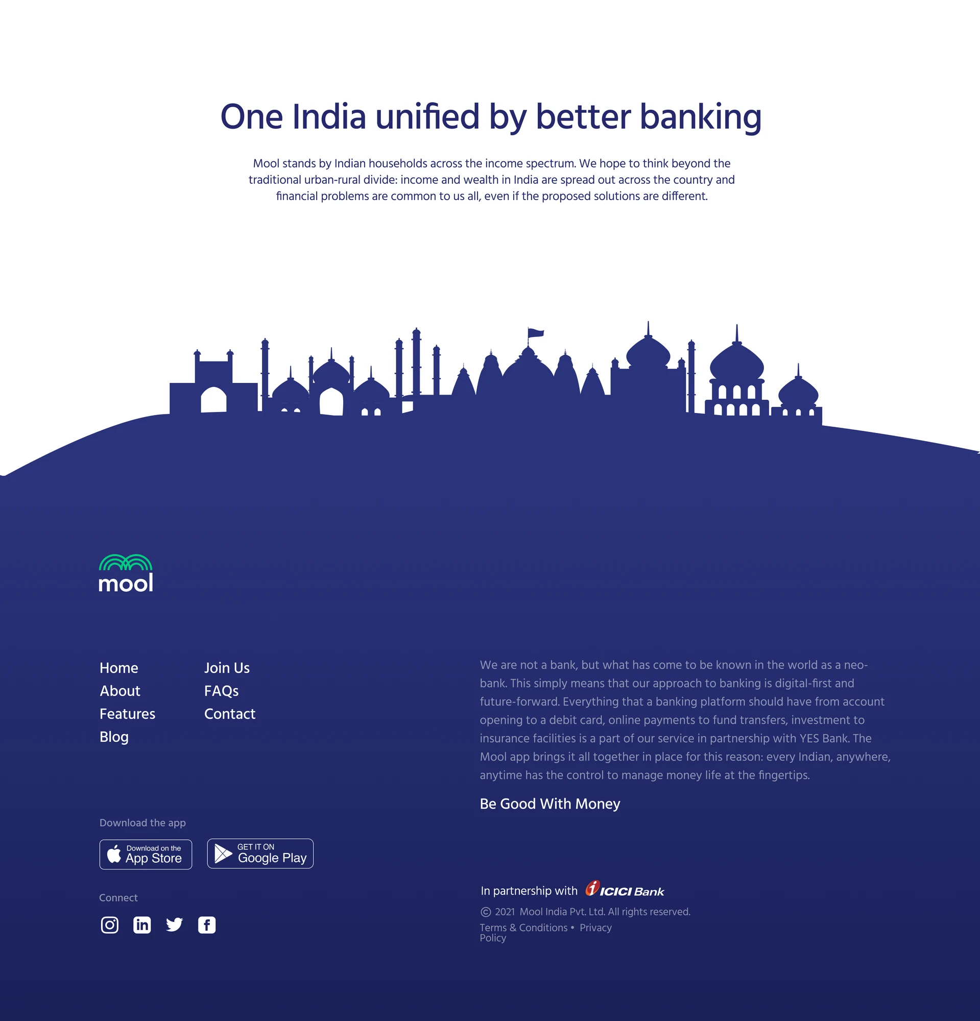
Back to top↑Before Mool I thought accessible meant simpler. This project taught me it really means resonant. People trust an app not because it looks clean but because it feels like it was made by someone who understands their world. We studied Indian folk art, regional patterns, and traditional color palettes not as decoration but as signals of belonging.
Every visual decision was tested against one question: does this make someone from a small town feel like this was built for them. Clarity is emotional, not just functional. A user who feels seen will trust you with their money.
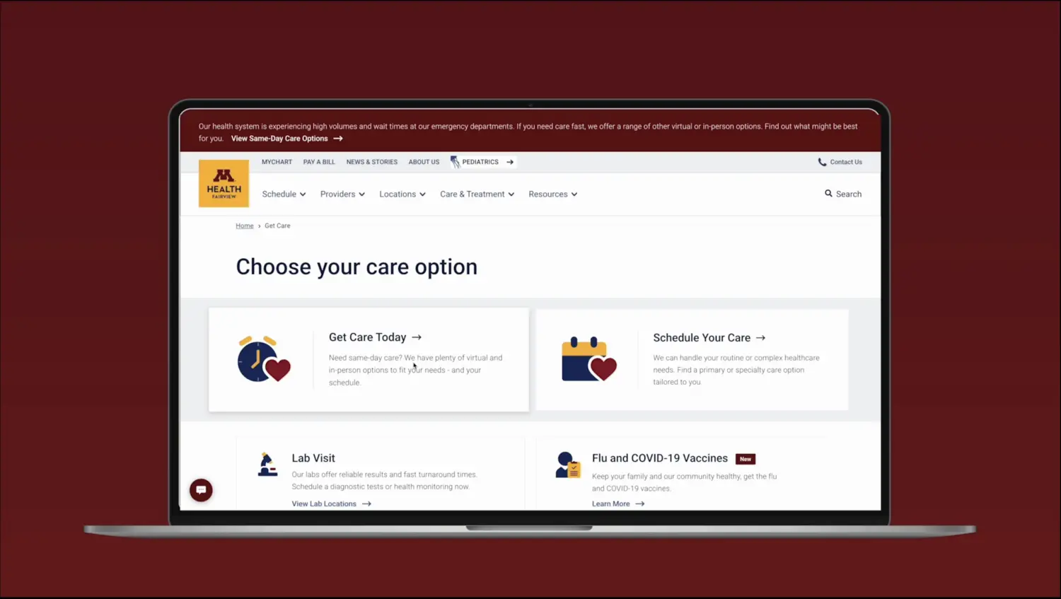 Next project M Health Fairview→ Enterprise UX for a health system serving millions. Back to top↑