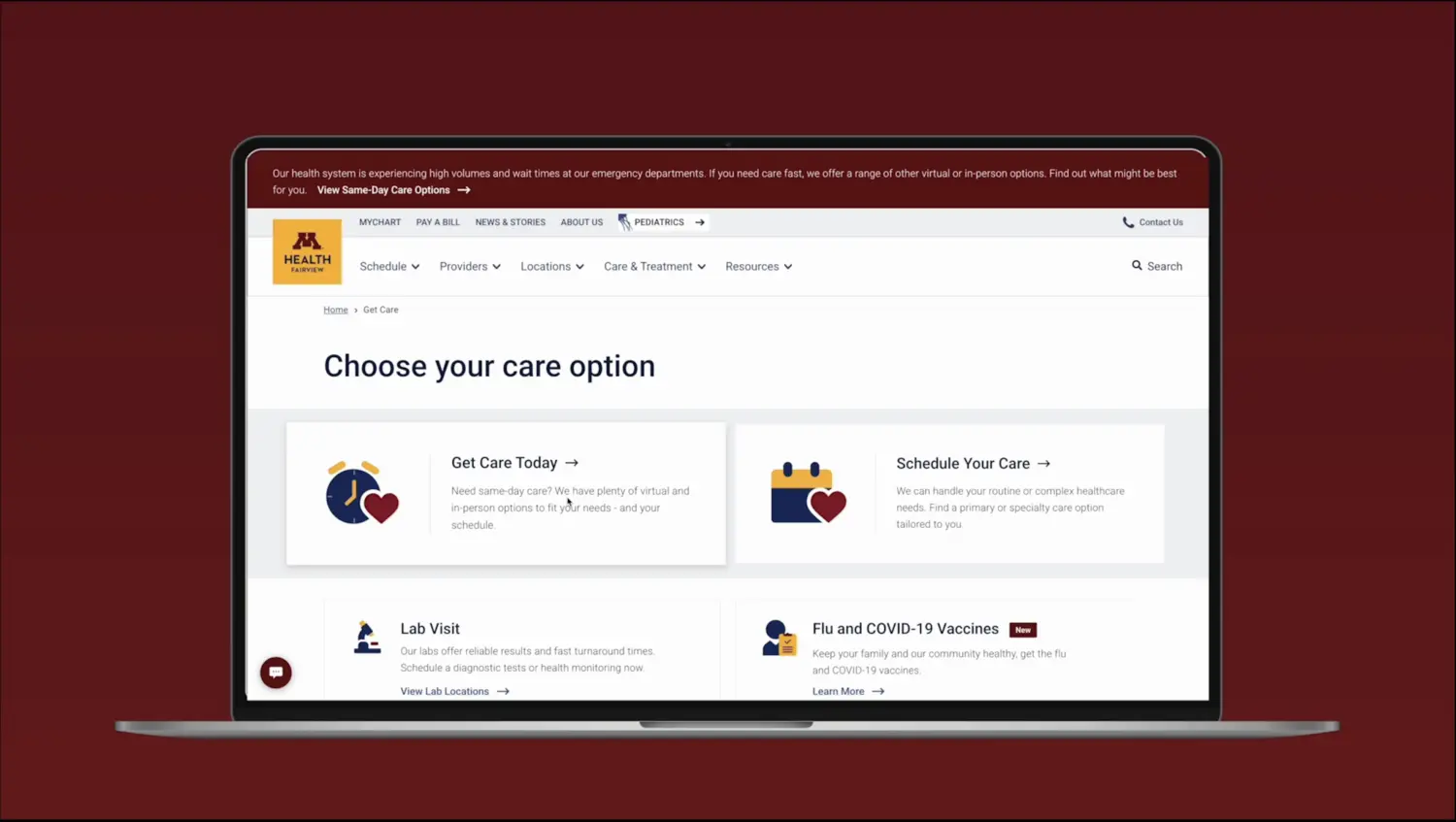
M Health Fairview
Project details
Project highlights
$13.6M+
revenue through scheduling
32%
more new patients scheduling
4.4
top rated care app
Redesigned M Health Fairview's care discovery and scheduling into one urgency sorted journey with Deloitte Digital, lifting scheduling revenue and moving routine demand away from the emergency room.
Healthcare · Enterprise UXProduct Designer · M Health Fairview
01 · About the project
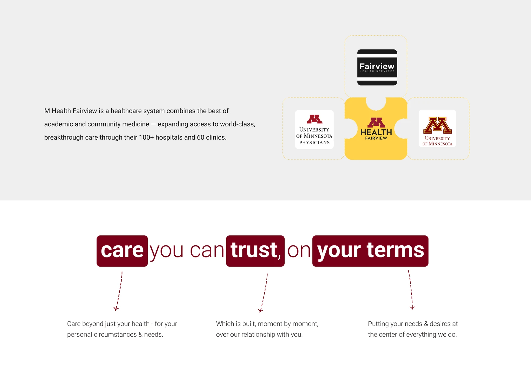
One of Minnesota's largest health systems: 100+ hospitals and 60 clinics, one promise to patients.

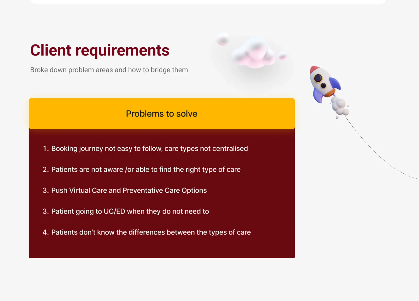
02 · The problem
Four problems for patients, five needs for the business. The brief was to solve both on one page.
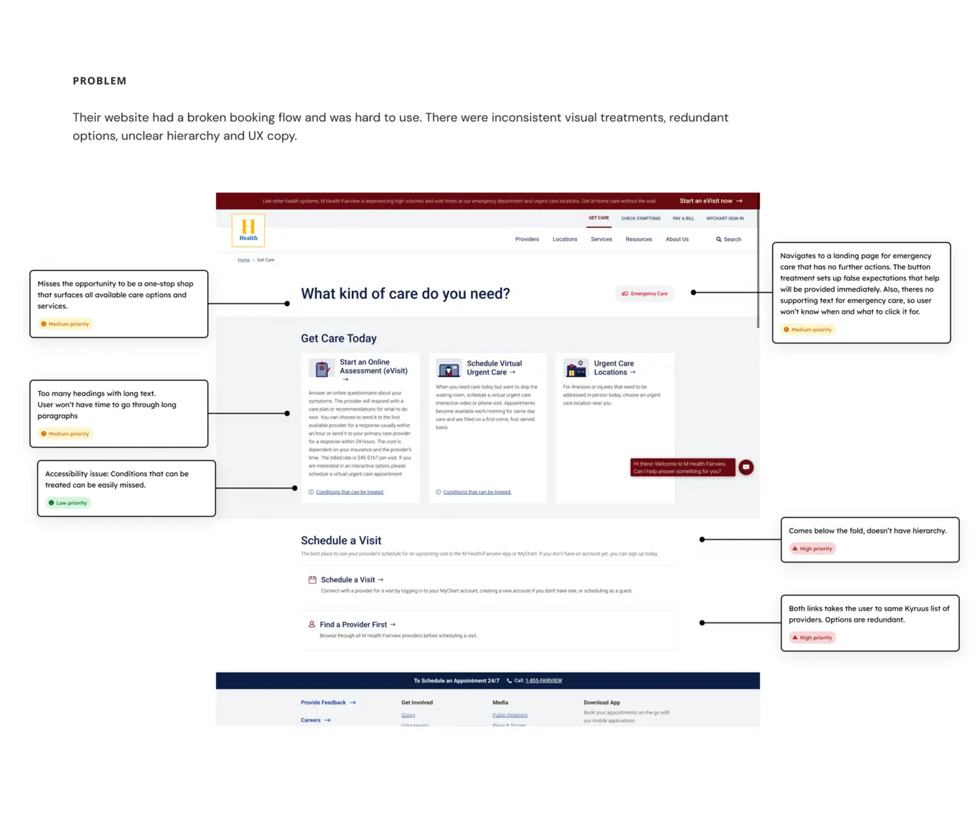
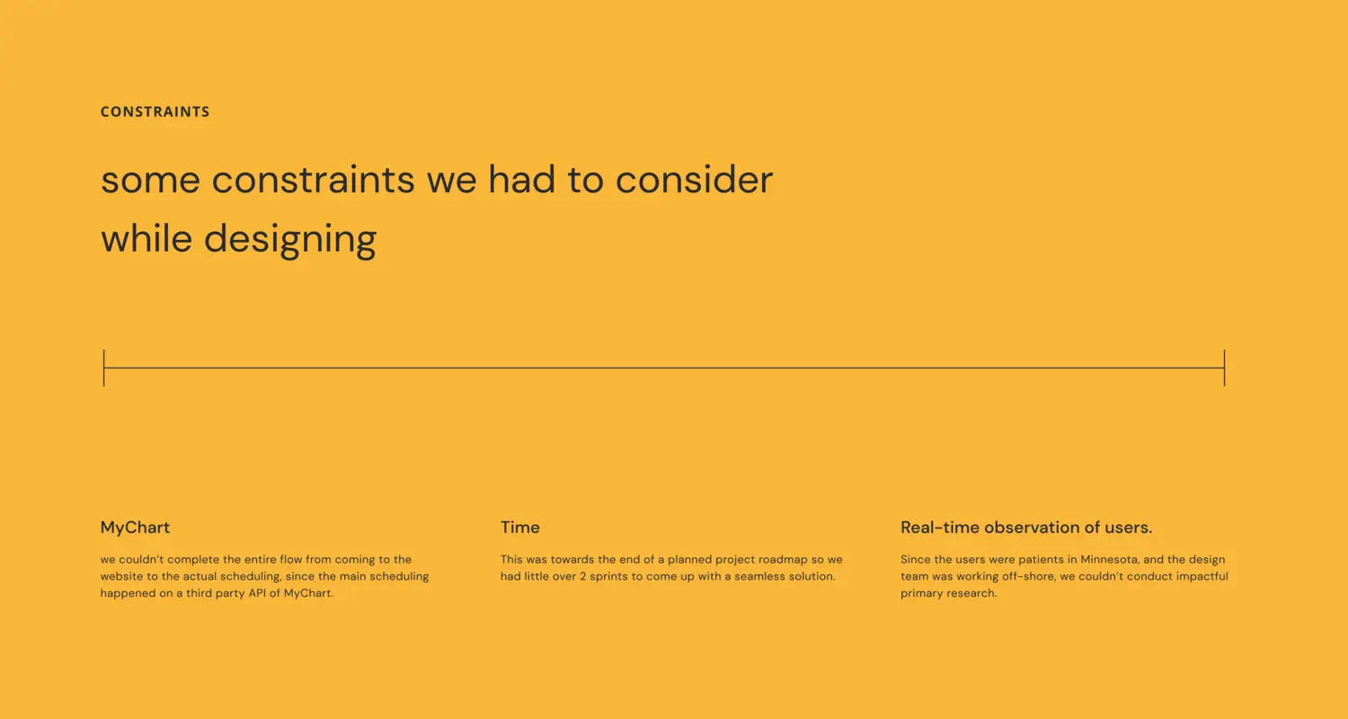
The audit: a booking flow that broke, an Emergency Care button that misled, and no patient access to test against.
03 · The process
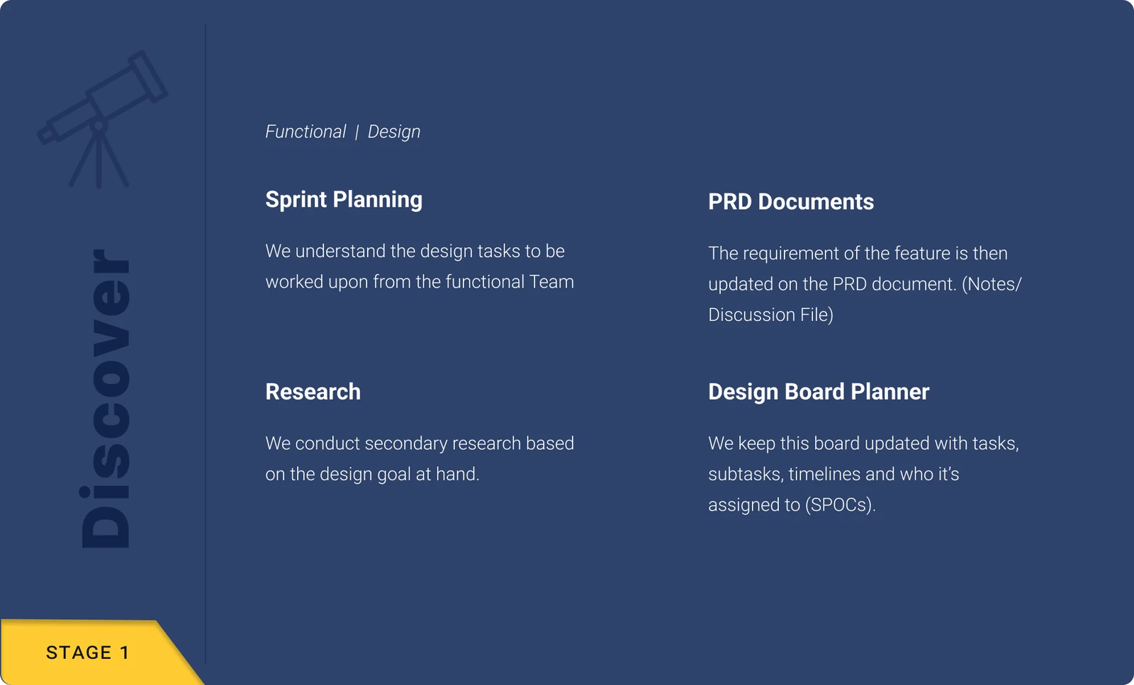
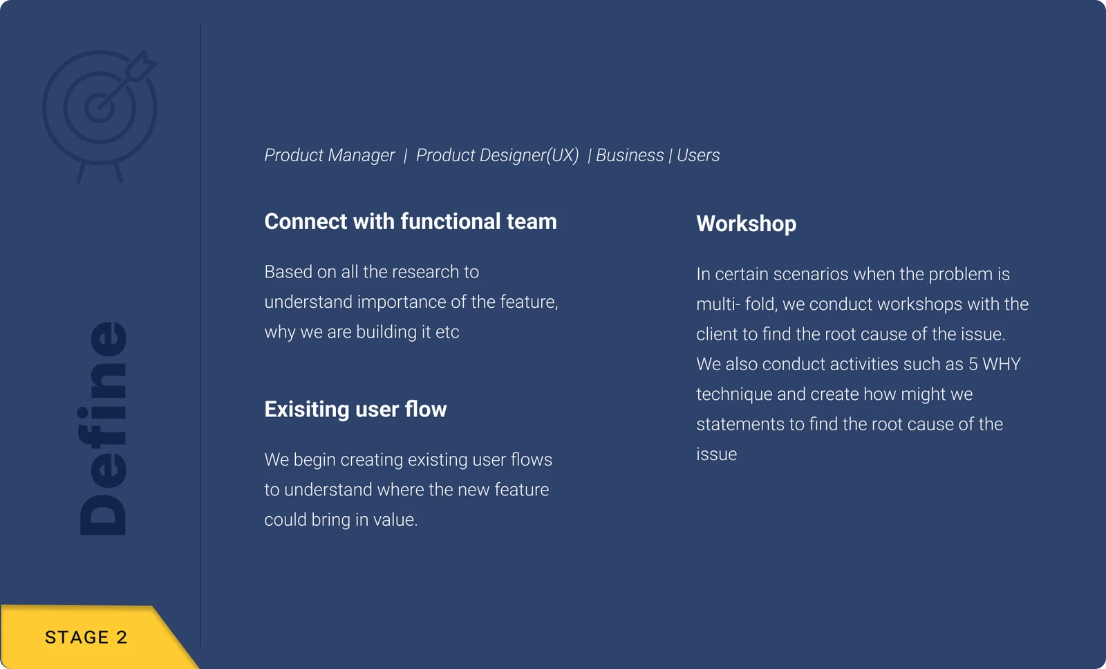
Six stages, two sprints. Discover and define with the functional team, design against a feasibility check, deliver hi-fi with dev notes, then QA every build.
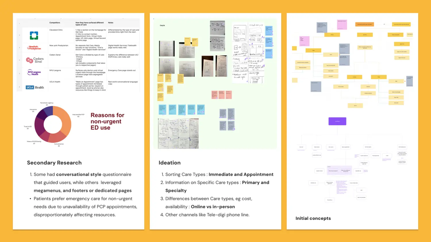
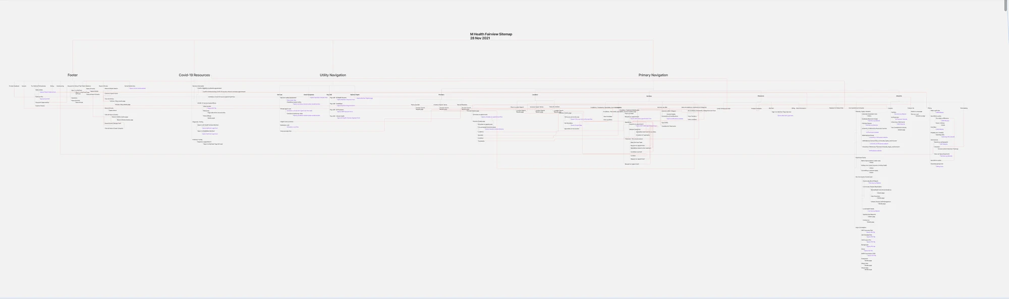
The information architecture: the full sitemap, and how each flow branches from it.
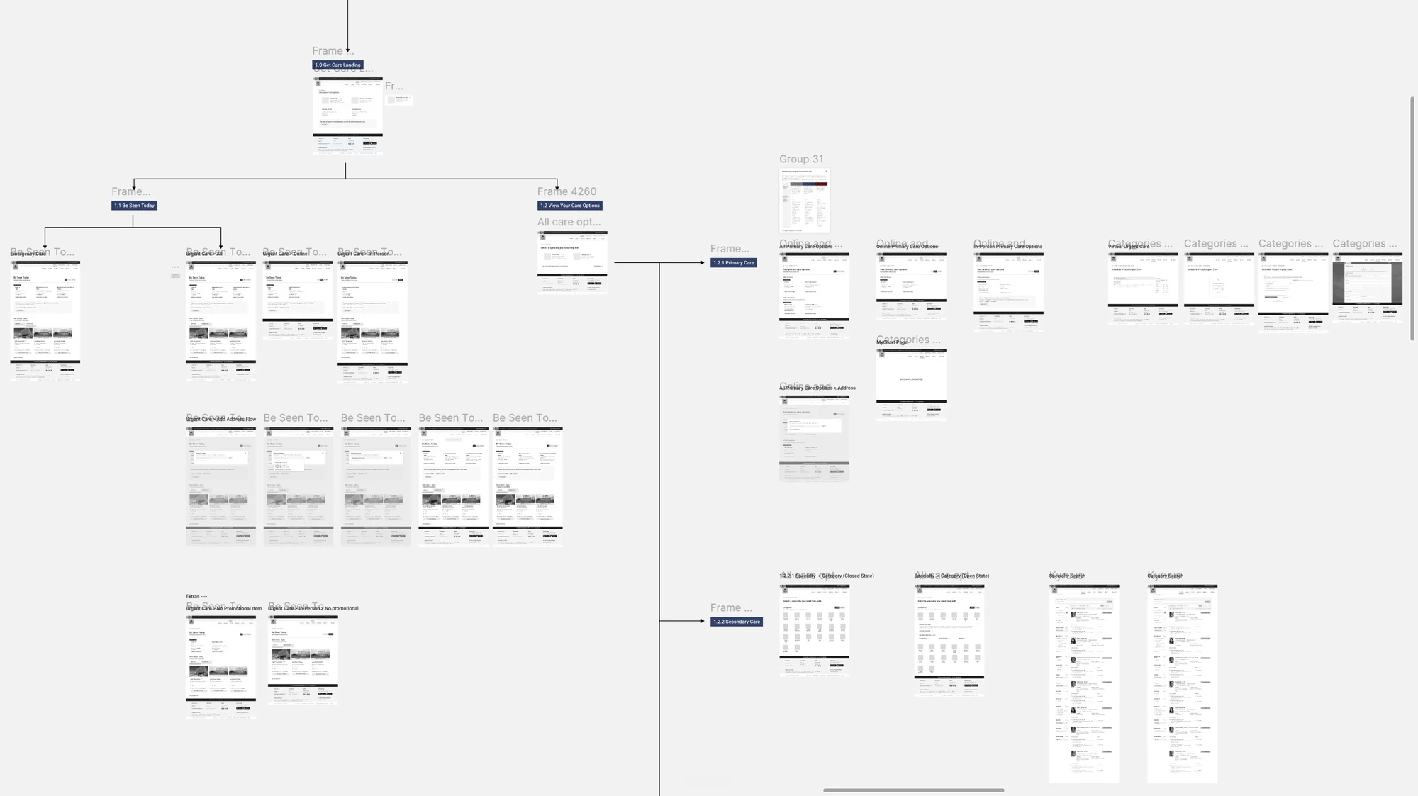
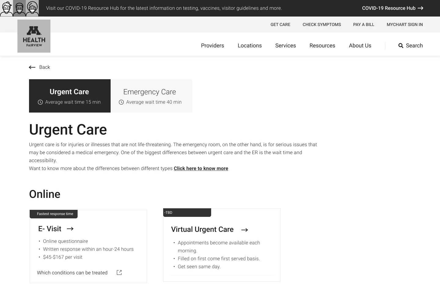
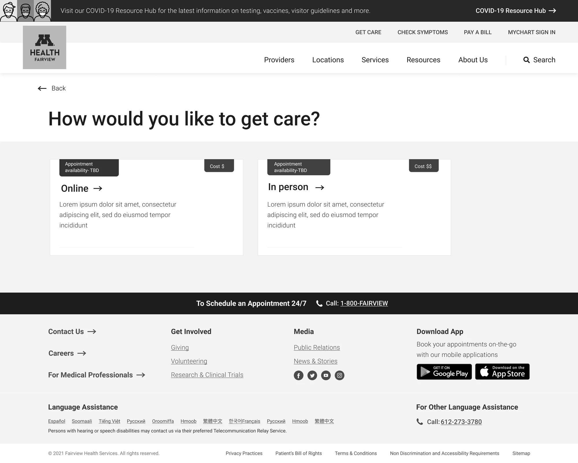
Wireframing, before any of the visual system landed.
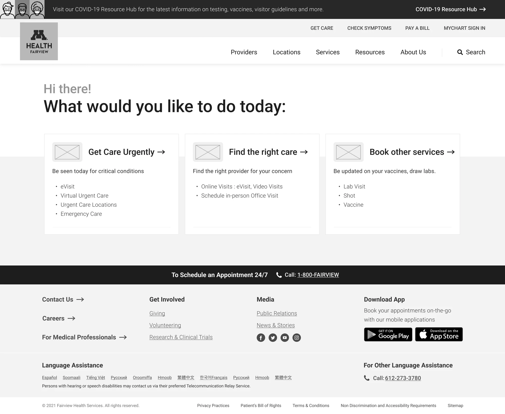
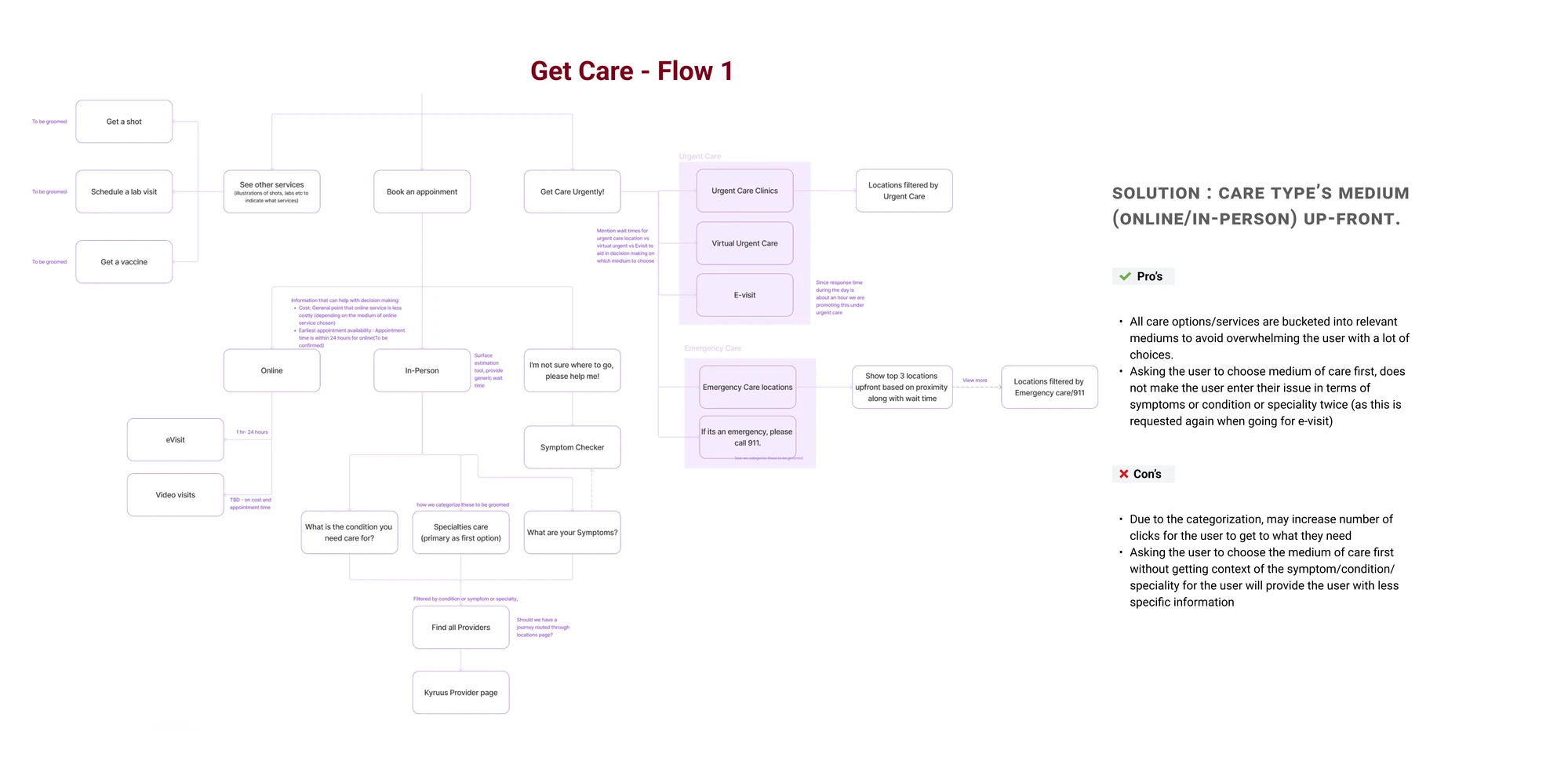
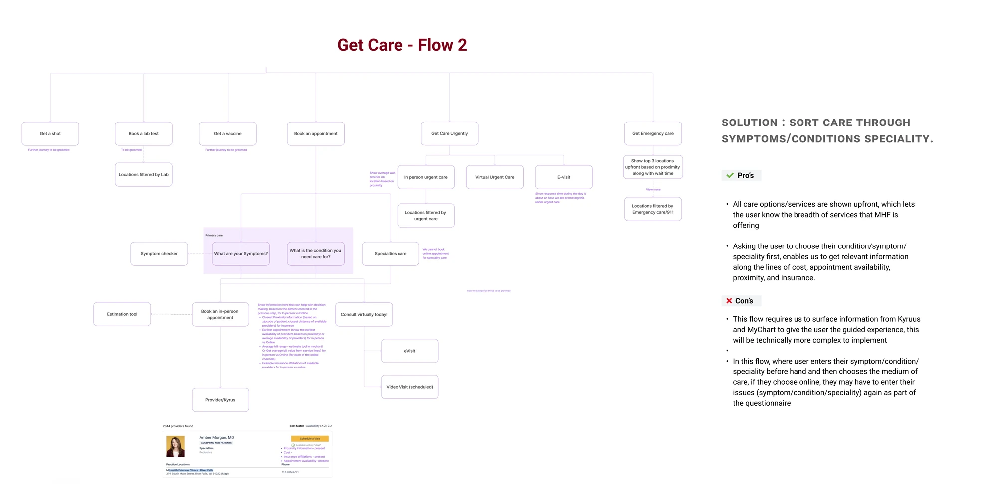
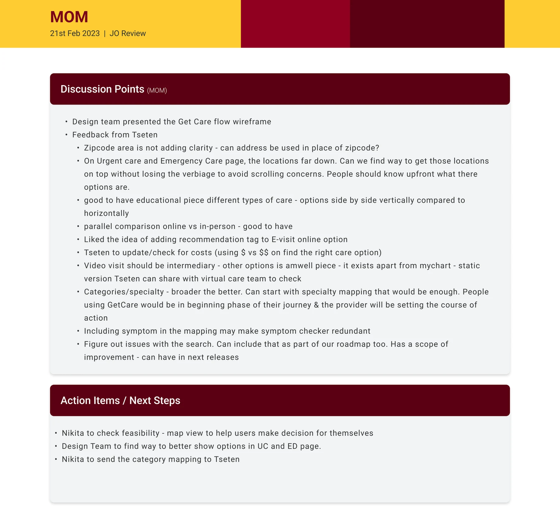
A discussion with the client about the designs.
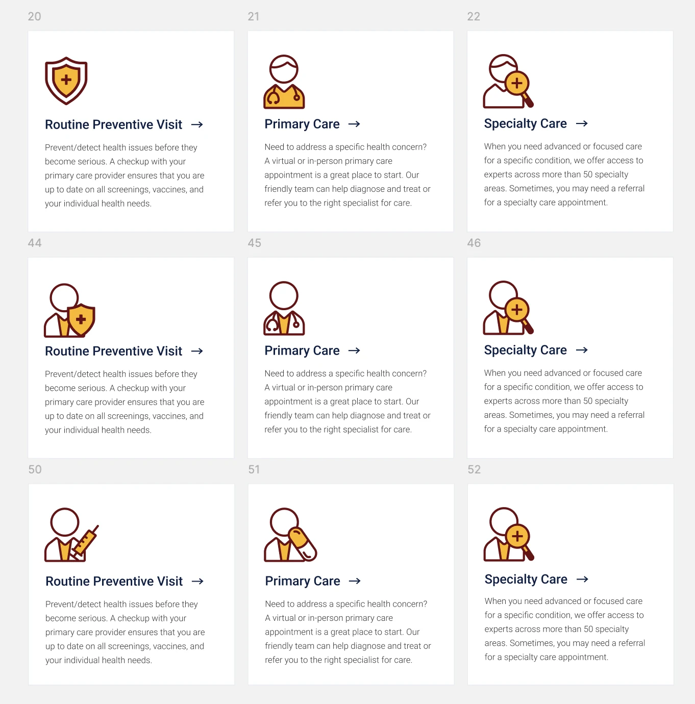
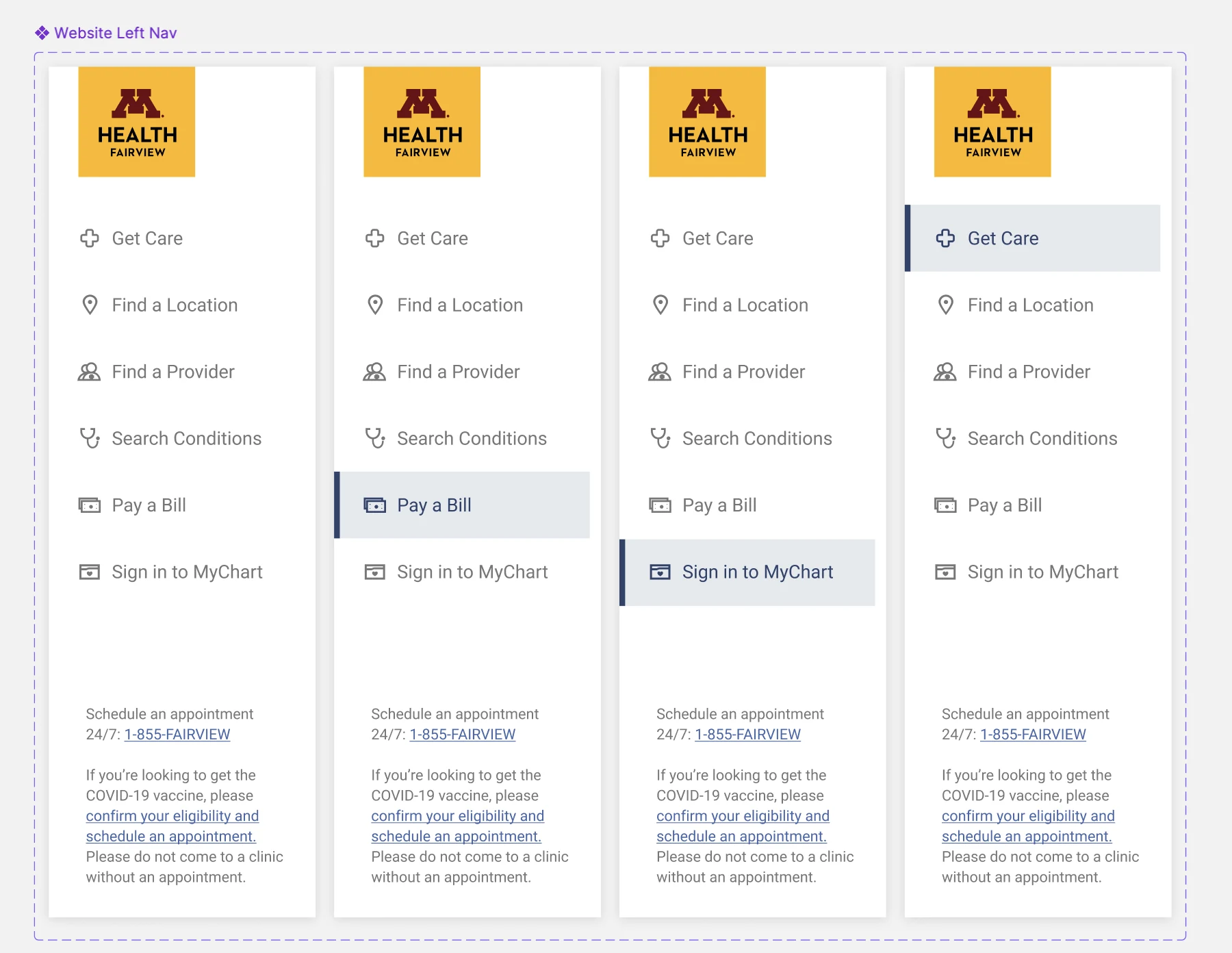
UI ideation: the specialty icon grid, and where it sits in the site's own navigation.
04 · What shipped
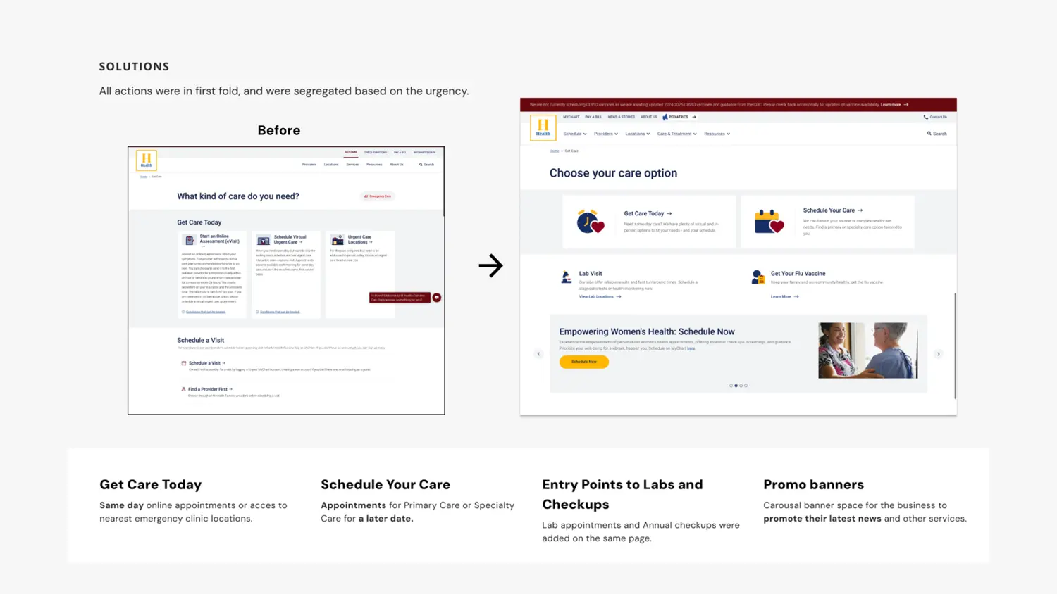
Before and after. Every action in the first fold, sorted by how soon you need care.
The new entry point, in motion.
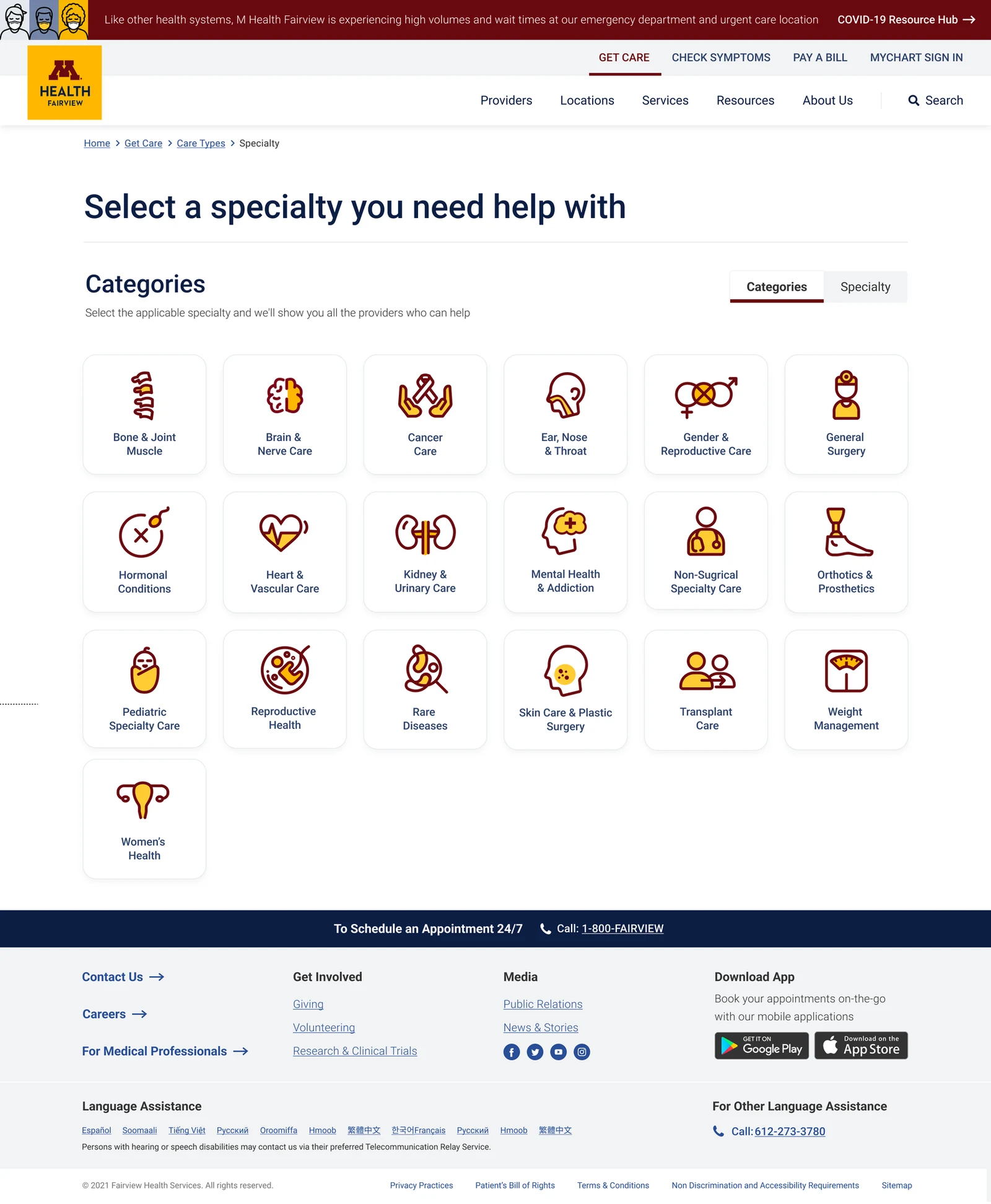
The specialty set that carries every care type.
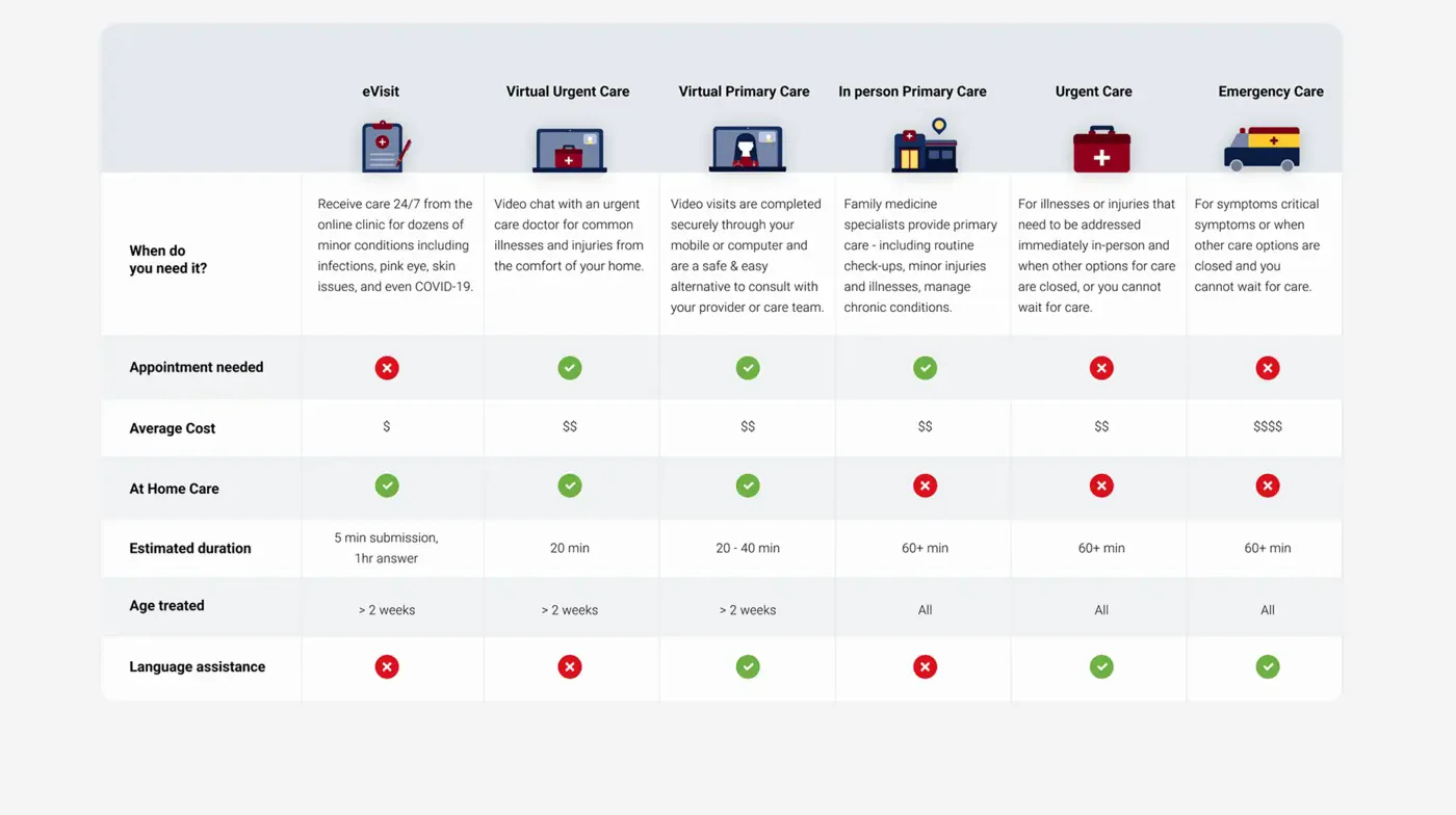
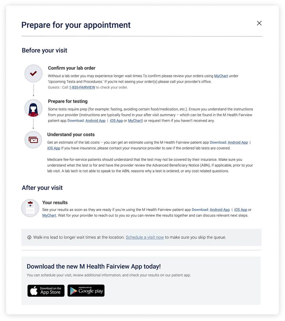
Care types compared by cost, wait and what they treat. A helper for patients who would rather be led, and a checklist for the visit itself.
</div>
05 · Impact
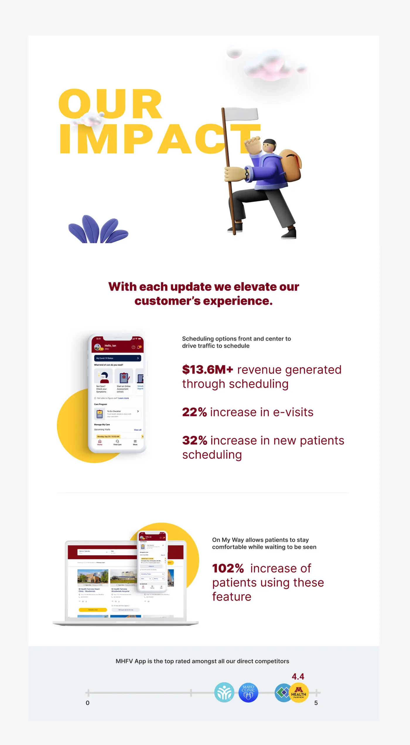
$13.6M through scheduling, 32% more new patients booking themselves, 22% more e-visits, and the top-rated care app against every direct competitor.
Back to top↑The hardest part of this project was not visual, it was deciding what a patient should see first. A person looking for care is often anxious and short on time, so every extra option is a small tax on someone who is already stressed. We kept returning to one test, does this help someone in the first ten seconds know where to go. Sorting the whole experience by urgency, rather than by how the health system is organised internally, was the decision that made everything else fall into place.
I also learned how much a single clear entry point can do for a business. By centralising every care option in one place and pushing the right patients toward virtual and preventive care, the same demand produced far better outcomes for both patients and the system.
 Next project Marriott→ A single pane of glass for the world's largest hotel network. Back to top↑