Sid Mehta
Marriott Bonvoy SPOG

Marriott Bonvoy SPOG

Project details

Partner

Deloitte Digital

Client

Marriott International

Scope

End to end employee app

Year

2023

Overview

Designed SPOG, a single pane of glass employee application for Marriott Bonvoy properties, unifying daily operations, reservations and loyalty enrolment into one calm, information dense dashboard.

Project highlights

9,000+

properties in scope

1 pane

for the whole shift

17%

lift in inventory accuracy

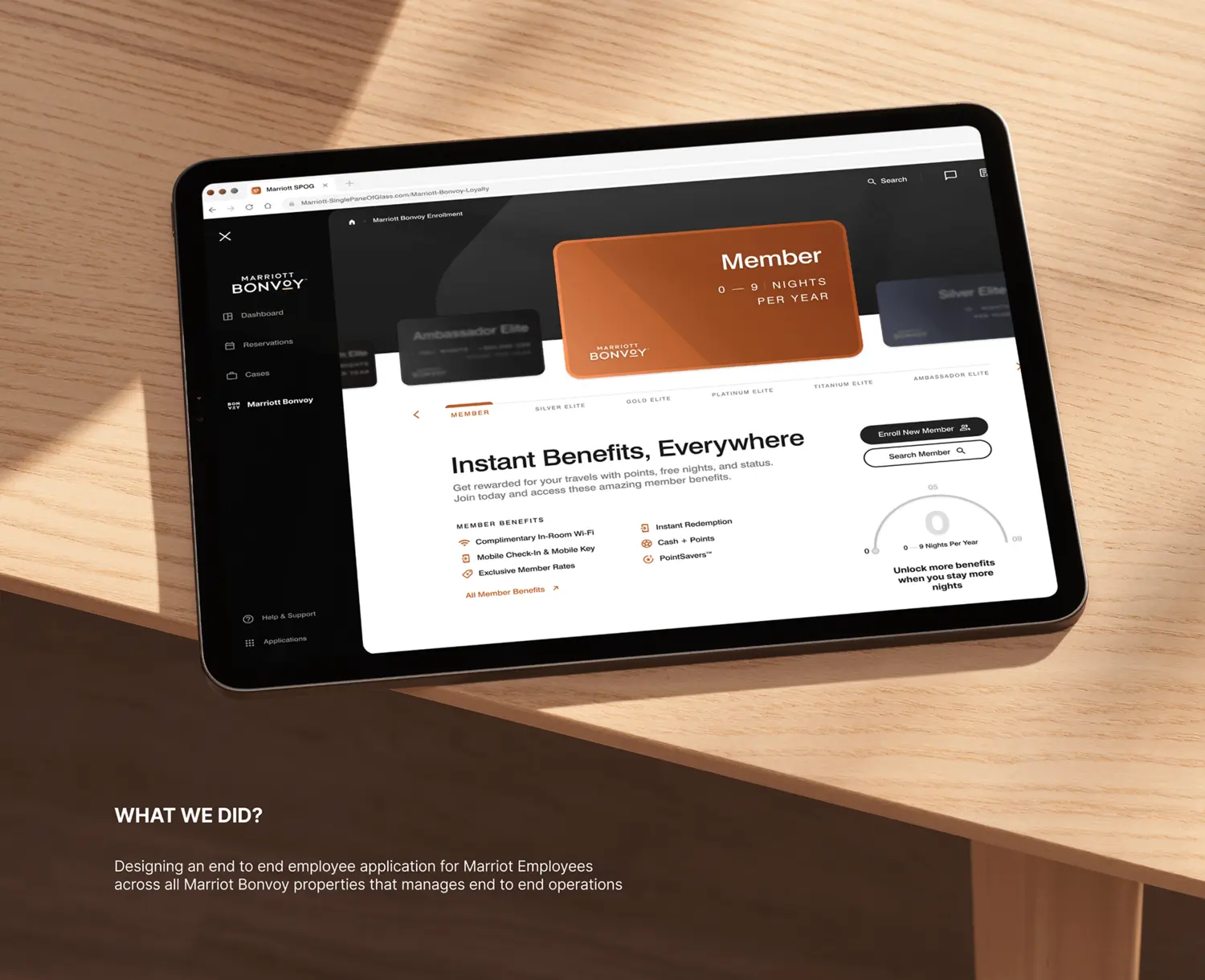
01 · What we did. An end to end employee application for Marriott staff across every Bonvoy property, from the daily operational overview to loyalty enrolment.

What we did, Marriott Bonvoy employee app

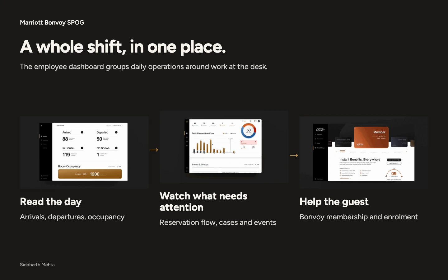
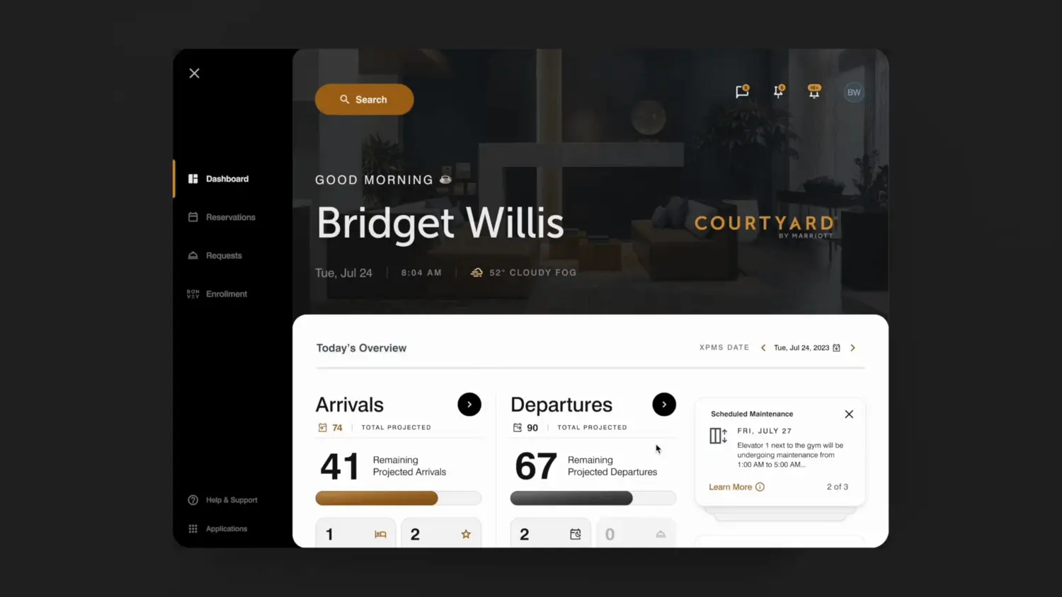
02 · The dashboard. Good morning, the whole shift on one pane, arrivals, departures and today's overview for the active property.

SPOG dashboard overview in motion

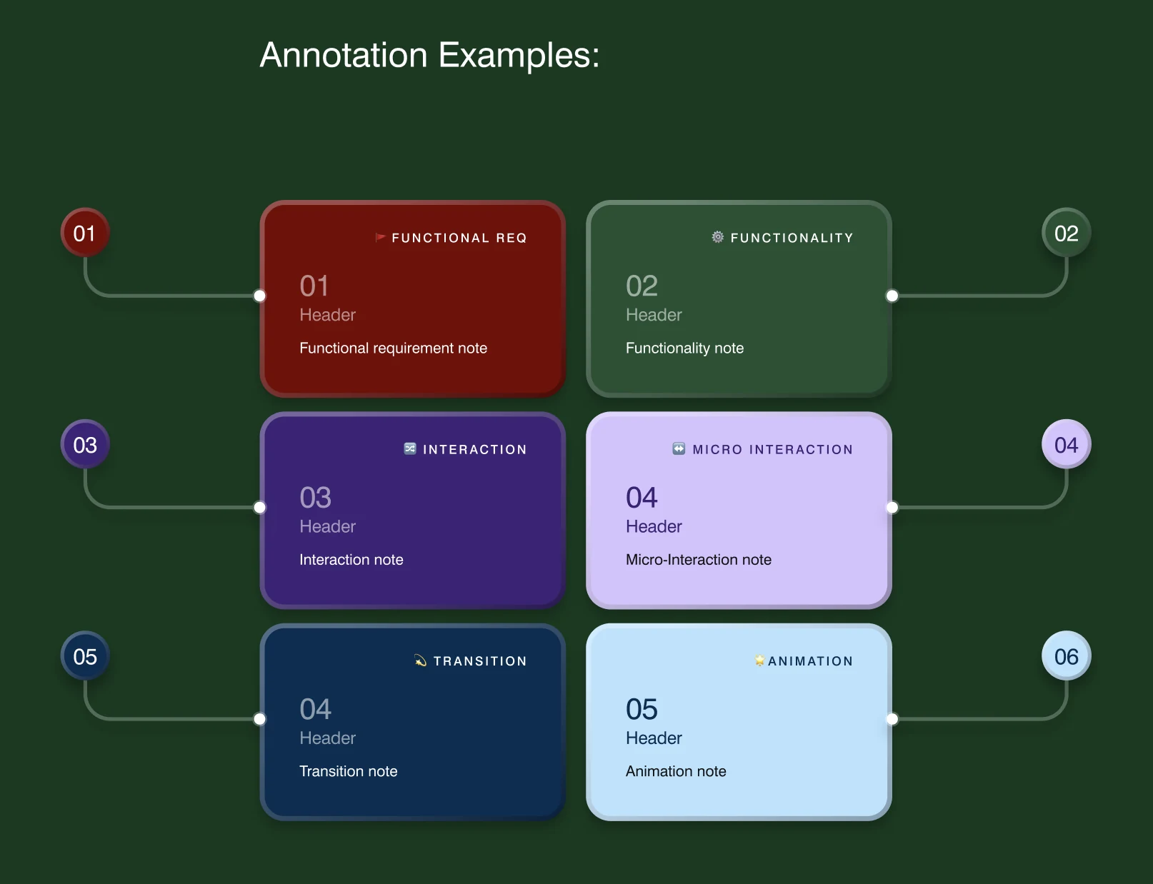
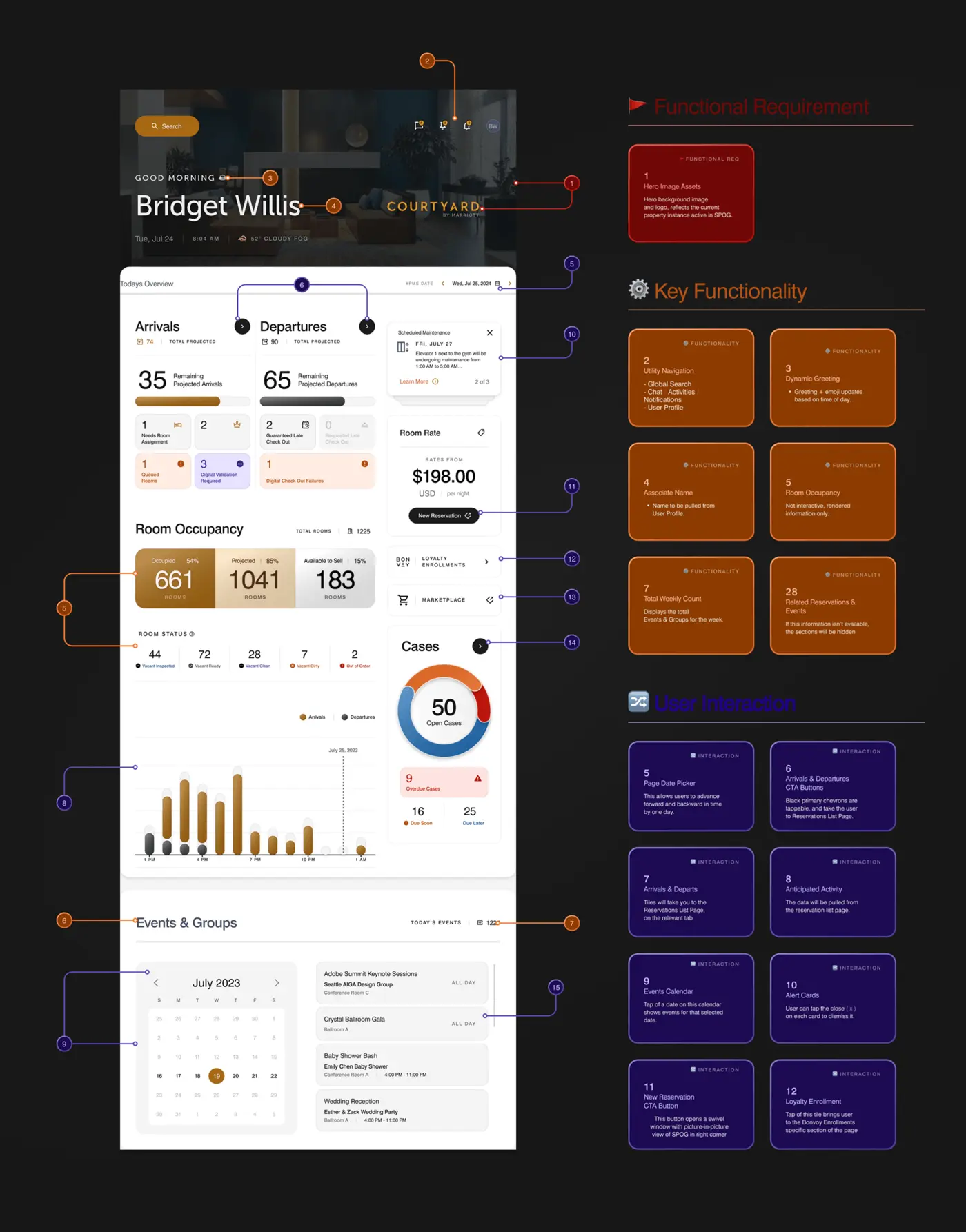
03 · The specification. Every element on the dashboard mapped to a functional requirement, a key functionality and a user interaction.

Annotated dashboard specification

04 · Operational overview. Arrived, departed, in house and no shows, with live room occupancy across the property.

Operational overview metrics

05 · Reservation flow and cases. Peak reservation flow through the day and an at a glance view of open, overdue and upcoming cases.

Peak reservation flow and cases

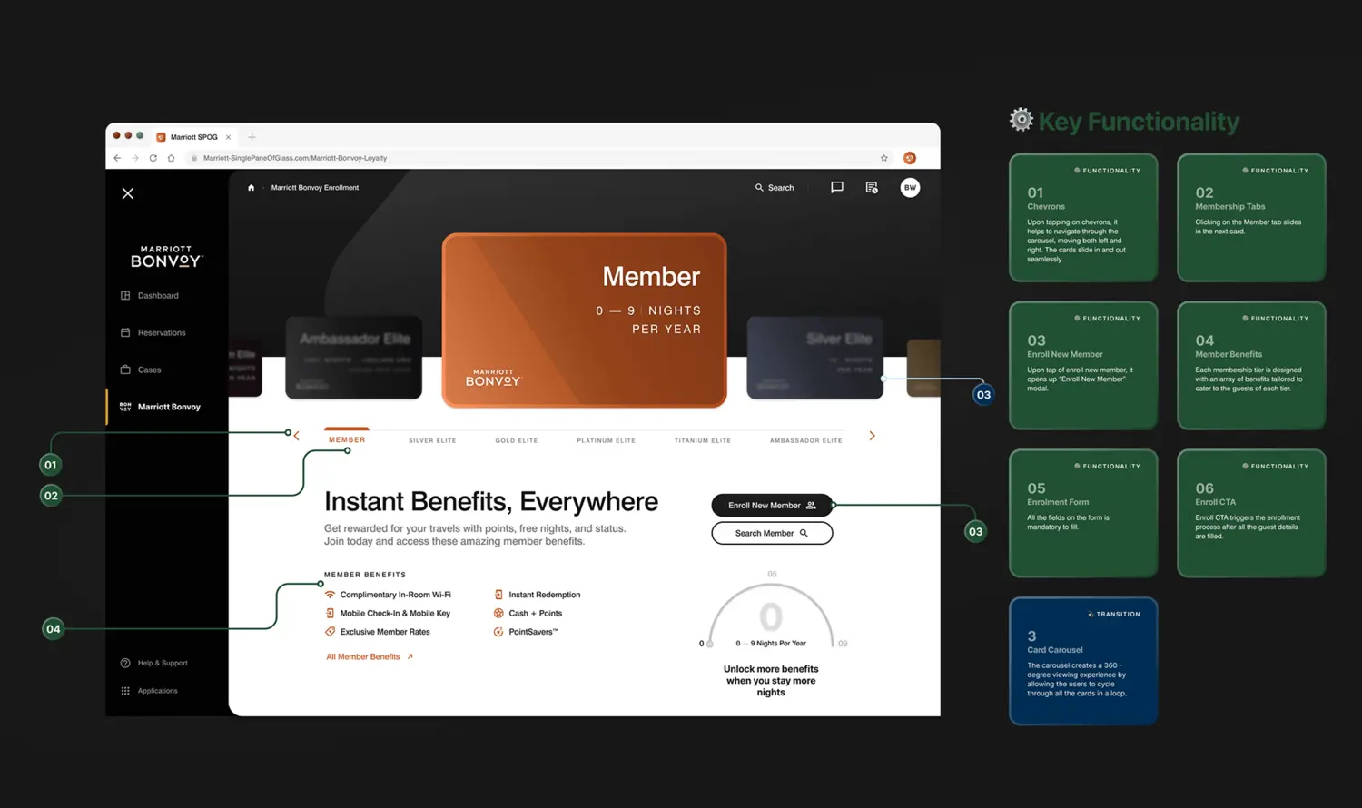
06 · Loyalty enrolment. A Bonvoy membership card carousel that lets an associate enrol a guest into the right tier without leaving the desk.

Bonvoy loyalty enrolment carousel

07 · Enrolment, specified. Each membership tier, benefit and interaction defined, from the card carousel to the enrol flow.

Loyalty enrolment key functionality

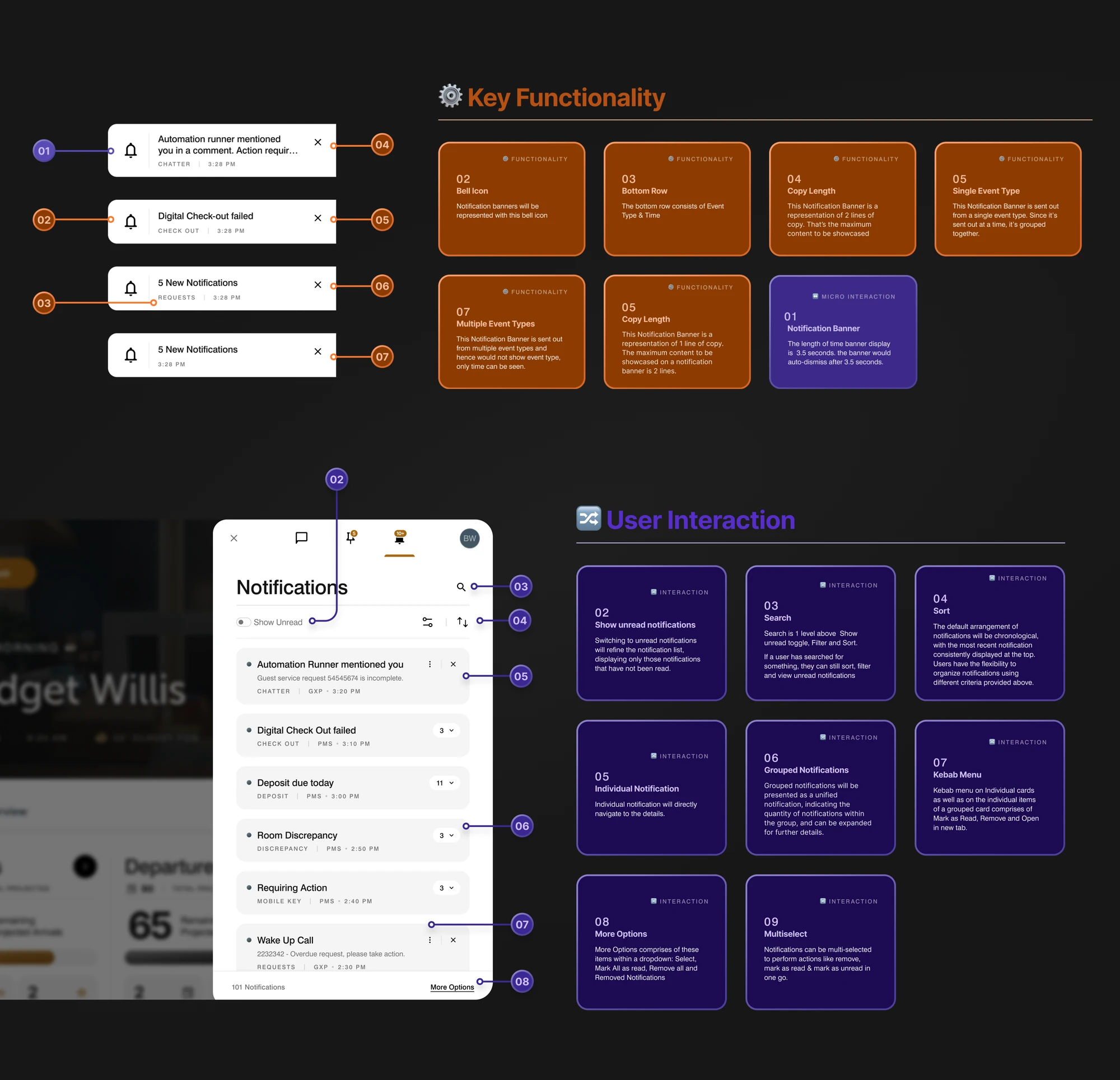
08 · Enrol a new member. A guided modal that opens over the dashboard so enrolment never pulls the associate away from their work.

Enroll new member modal

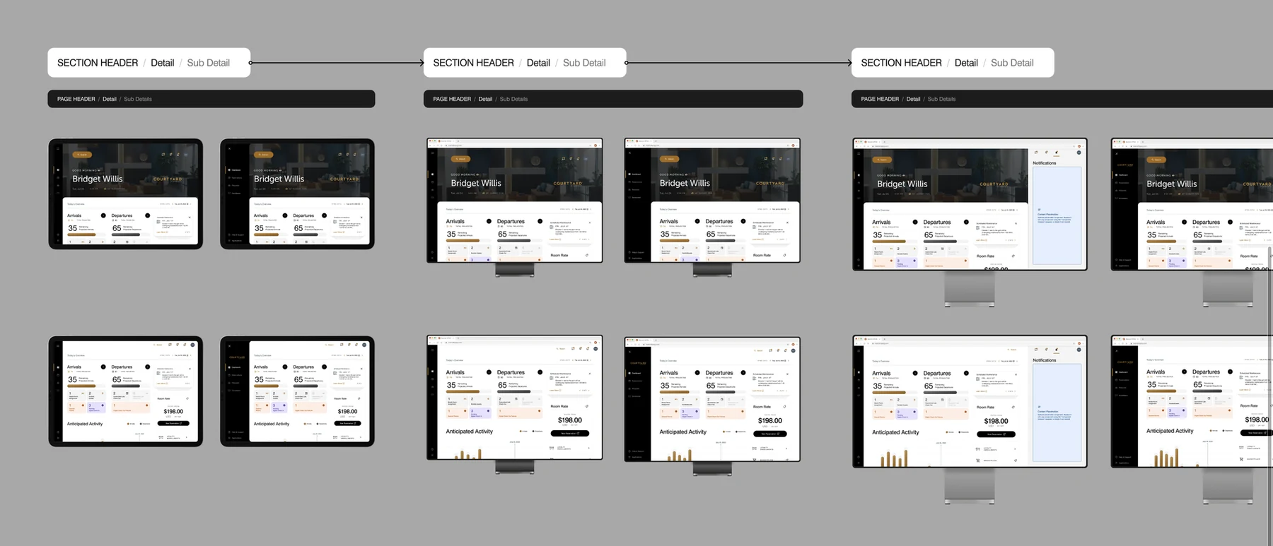
09 · One system, every screen. The same operational experience designed for a tablet at the desk and a browser in the back office.

SPOG on desktop browser

Design decisions

The calls that shaped this project — what I chose, why, and what each choice cost.

  1. Built one dashboard that reads in a glance, not a wall of dashboards

    An associate does not have time to hunt across screens mid shift. We put the whole day on one overview, arrivals and departures, occupancy, room status, cases and events, with a strict visual hierarchy so the most time sensitive numbers read first and detail waits one tap away.

    TradeoffFitting that much on one surface meant relentless editing of what earned a place on the first screen. Several secondary metrics had to move into detail views to keep the overview calm.

  2. Used a warm neutral system with a single accent to keep dense data calm

    Operational data is unforgiving, and colour used carelessly turns a dashboard into noise. We held to a warm neutral base with one gold accent and reserved stronger colour only for states that need attention, so an alert actually feels like an alert.

    TradeoffA restrained palette gives up some quick visual coding. We made up for it with shape, weight and position so meaning still comes through without leaning on colour.

  3. Designed loyalty enrolment as a guided, glanceable flow

    Enrolling a guest into Bonvoy at the desk had to be fast and hard to get wrong. We built a membership card carousel and a guided enrolment with clear tiers and benefits, so an associate can move a guest through it while talking to them.

    TradeoffA guided flow is less flexible than a raw form. For the rare edge case an associate has fewer shortcuts, but the common path is far faster and less error prone.

Enterprise tools are usually judged by how much they can show. This one was judged by how fast a busy associate could understand a shift. That reframing changed every decision. The dashboard carries a large amount of live data, arrivals, departures, occupancy, room status, cases and events, yet it had to read in a glance for someone standing at a front desk mid conversation.

The craft was in restraint. A warm neutral system, one accent and a strict hierarchy let dense information feel calm instead of overwhelming. Designing the same experience for a tablet at the desk and a browser in the back office taught me how much layout discipline a real operational tool demands.