Sid Mehta Works
Illustrations

Illustrations

Project details

Role

Solo

Duration

2018-2025

Tools

Illustrator · Photoshop · Procreate

Client

Self Initiated

Project highlights

2018-2025

seven-year visual archive

3

illustration tools in rotation

Solo

independent visual practice

Overview

An independent illustration practice developed over seven years that sharpened the visual range behind the product and spatial work. The full archive is here for anyone who wants to see the trail.

Illustration · Visual DiarySolo · Self Initiated

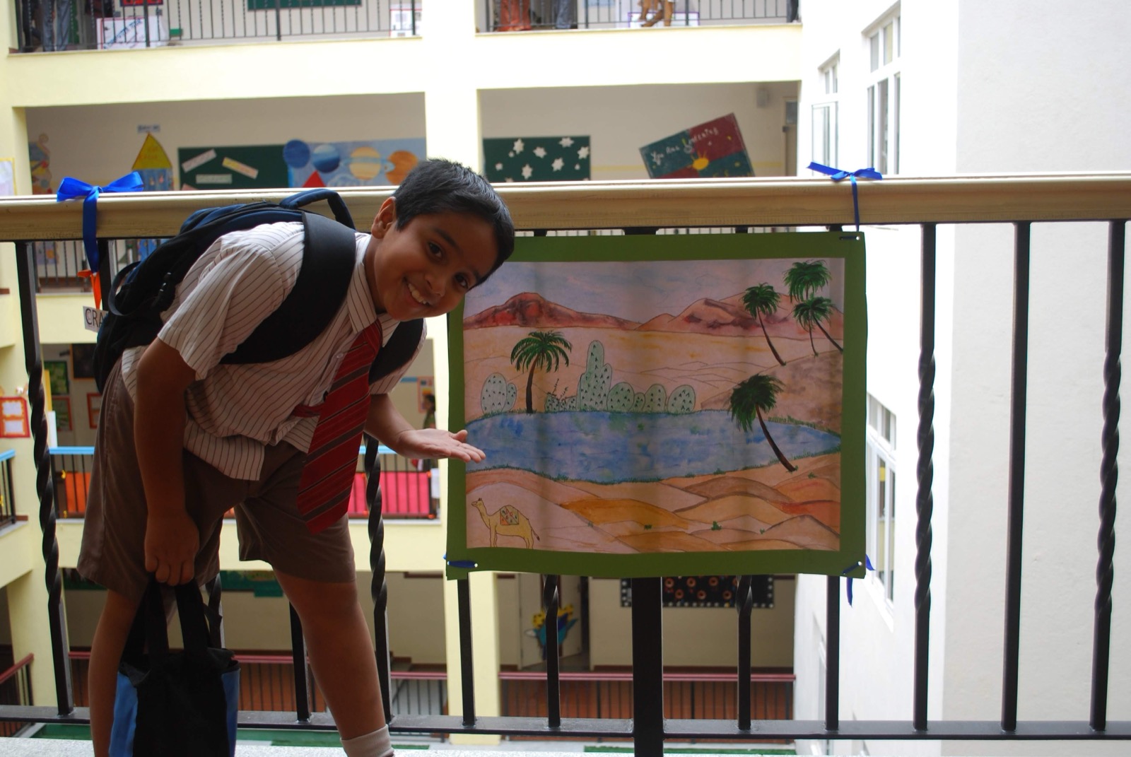
Presenting an early illustrated panel at school

30 songs illustrated.

An essay about hearing the same song differently every time, set on a pink field
The 11.2 km/s mark tattooed on a forearm
The 11.2 km/s cube, drawn in white line on a field of coloured strokes
Sixteen line drawings, each paired with a handwritten line
Affection: an entwined figure drawn in one continuous line
Into the sun: a knot of scribbled line

Illustrative book.

There Will Come Soft Rains, the cover and spine
The opening spread: I have rewritten this story, Ray Bradbury has, I illustrated it
A spread at 11:15 and 11:40, the house still setting the table
A spread at 9:05, the forest and the lake
A spread at 10:15 and 10:30, the fire reaching the stairs
A spread at 12:00 and 2:35, the house calling fire
A spread at 11:15 and 11:30, the mower still cutting the lawn
A spread at 11:00, the animals coming through the window
A spread at 12:00, the last voice repeating the date
A spread at 4:00 and 5:00, the nursery walls
Dashavatara, the title
A single flame in a cloud of ash
The Dashavatara explained as the ten incarnations of Vishnu, and as the evolution of consciousness
The ten avatars, each drawn as a gold medallion

Mock-up of cards.

Buddha, as a card and its explanation
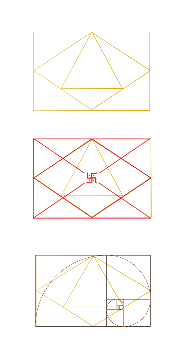
Three geometric constructions used to build the cards
Inside, outside
Kundali: the birth chart drawn as a geometric figure
Aankhein: the eye, drawn in gold line

Font designed by me.

Cut paper letterforms laid out on the studio floor
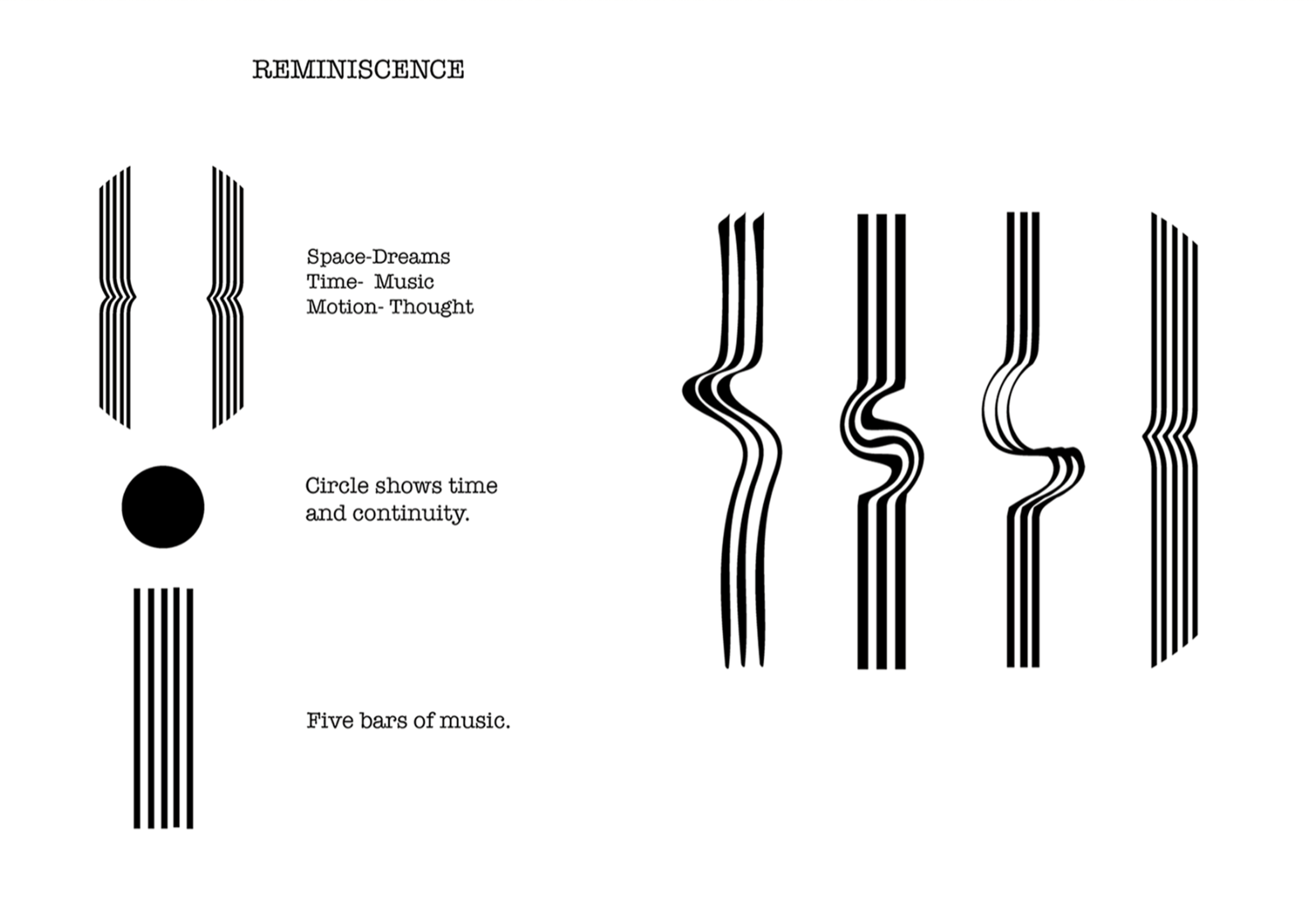
The brief: use time, space and motion to create a font. Music for time, dreams for motion, thought for motion
Laying out the specimen sheets on the floor
Reminiscence: the logic of the letterform, five bars of music and a circle for continuity
Three letters from the typeface, set in white on black
The full character set
Bye bye, hello: the typeface animating between words

Made for an Indian small shop owner.

Apna Adda, in Devanagari on red
The shop the project is named after: after college we all used to eat here and it became our spot

Settled on Apna Da, meaning my spot.

The naming and concept board on a studio wall
The owner behind the counter: garma garam milega bhai

Ideating logo type.

A drawing of the shopfront, with the menu beside it
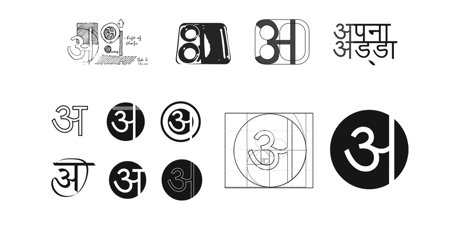
Logo exploration, from wordmarks to seals
The mark applied to packaging cubes
Building the अ monogram

Menu.

The menu, in red
Packaging patterns, one per dish
Reflection

These illustrations track how my visual instincts developed over the years. Without a brief, it was easier to take risks, try things that contradicted each other, and move between structure and intuition without needing to justify the shift. The value is not in any single piece but in the accumulation. Looking back at all of it together is where patterns appear.

Back to top
Next project Broken and Beautiful A public interaction project inspired by the Strangers Project. After hours reading ano... Back to top