
Mool
Project details
Led visual design for a neo-banking product that made everyday financial tools feel familiar and trustworthy for underserved communities across India.
Project highlights
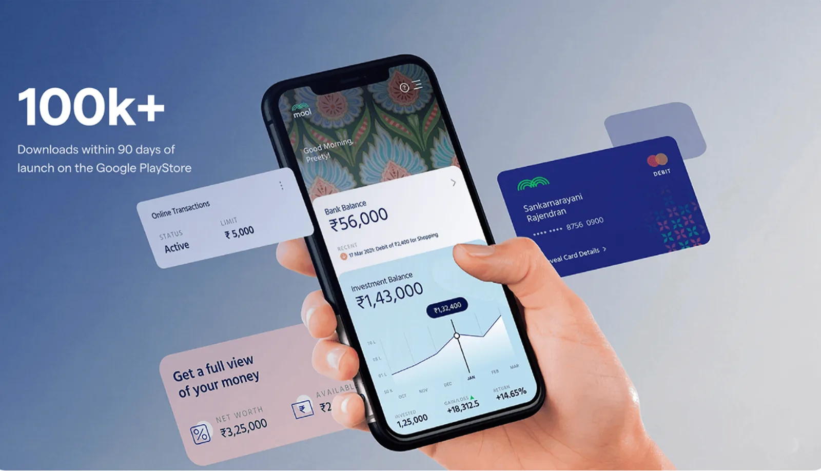
100k+
downloads
6 months
design timeline
Kyoorius
Design Award · 2021
Design decisions
The calls that shaped this project: what I chose, why, and what each choice cost.
-
Built the folk-art vocabulary into the system, not onto it
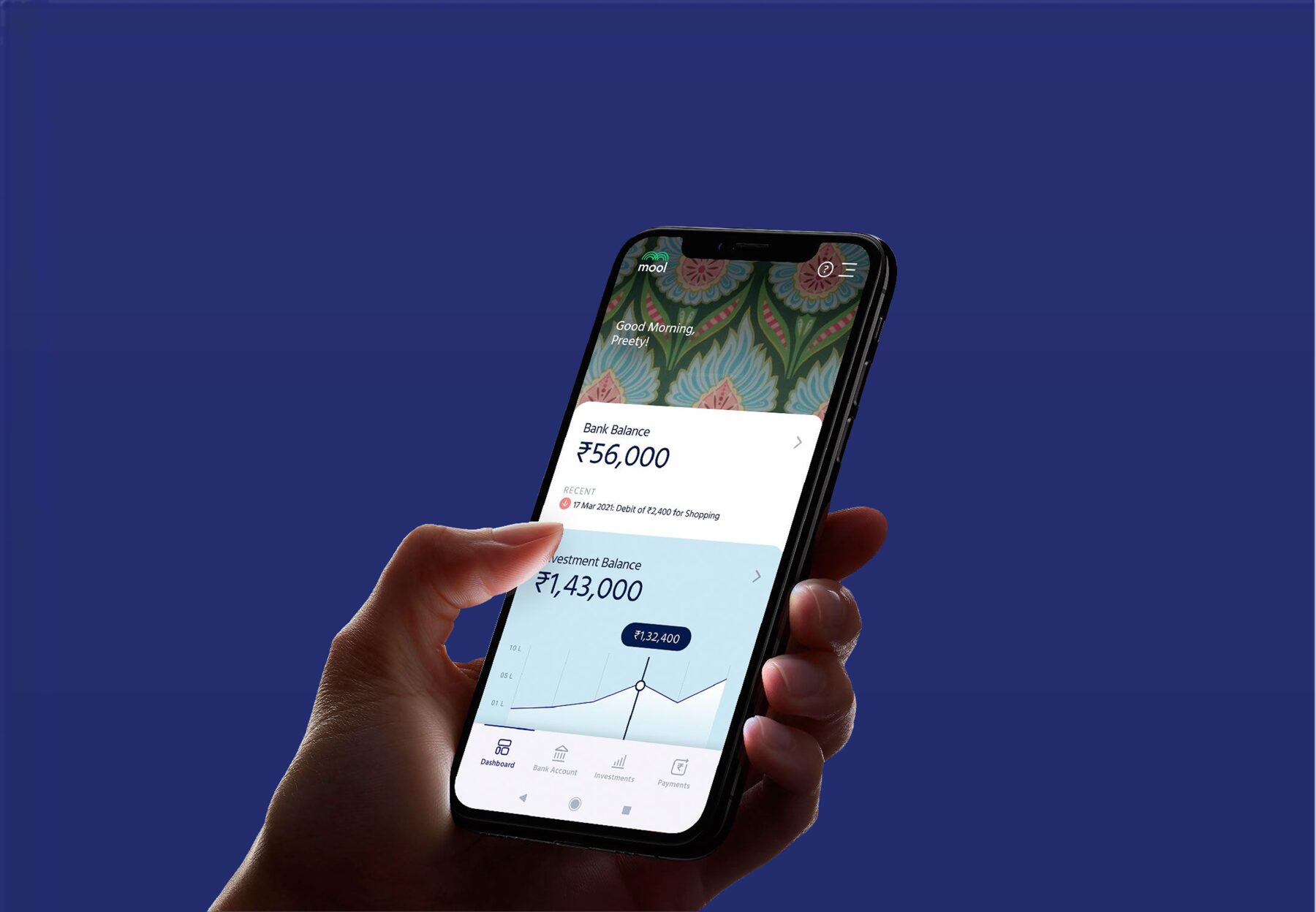
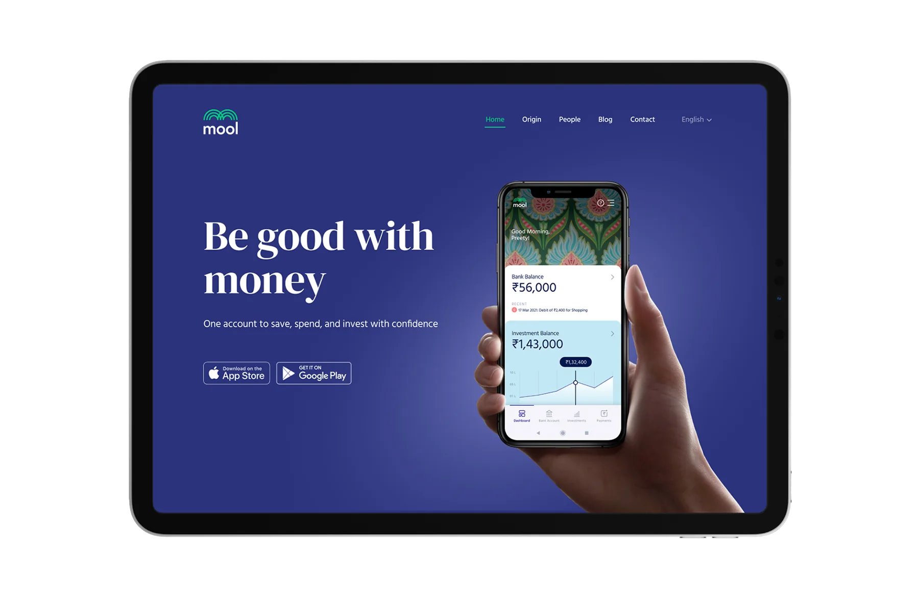
Every fintech product aimed at this audience looked like a Western banking app that had been translated. The visual language itself said the product came from somewhere else. Regional motifs went into the illustration set, the empty states and the transaction confirmations, so the ornament carried meaning about belonging rather than sitting on top of a neutral layout as decoration.
TradeoffIt made the design system slow to extend. A new screen could not be assembled from generic components. Someone had to decide which regional vocabulary it belonged to, and that decision needed a person who knew the reference.
-
Kept the numbers plain while the rest of the interface stayed rich
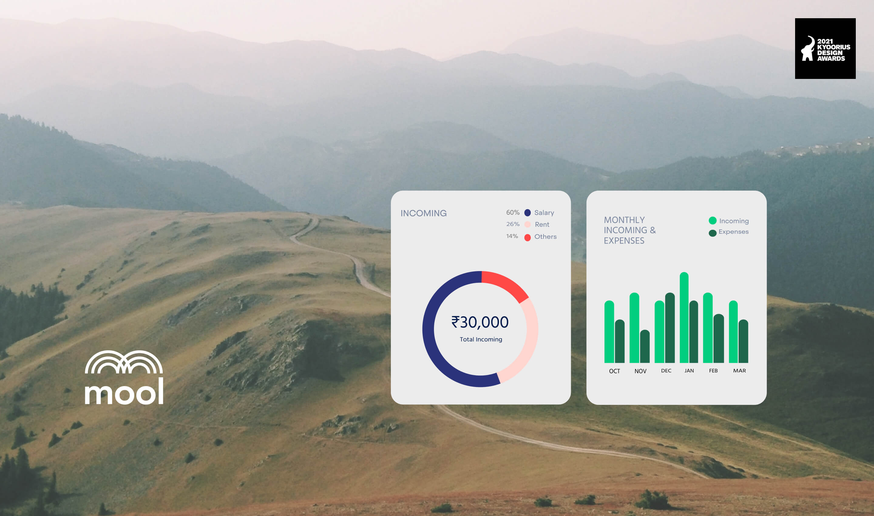
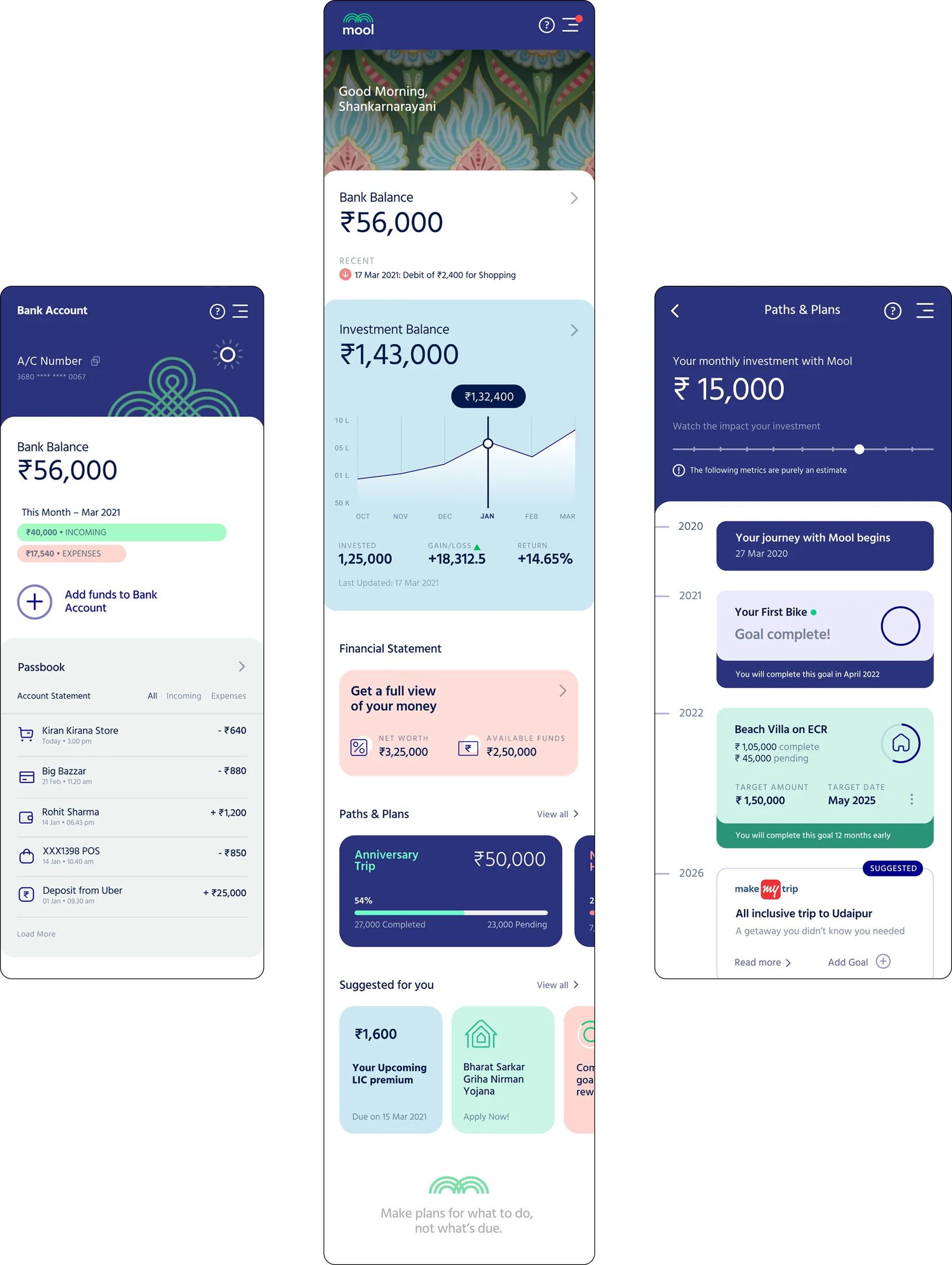
Trust in a banking app is won or lost at the balance. Whatever richness the surrounding screen carried, amounts, dates and account numbers stayed in one neutral face at high contrast with tabular figures, so nothing about the styling could be misread as a flourish placed over someone's money.
TradeoffThe two voices share a screen, and on the dense views (statements, full transaction history) the split reads as unresolved rather than deliberate. It is the part of the system I would rebuild first.
-
Designed for a first-time smartphone user, not a first-time banking user
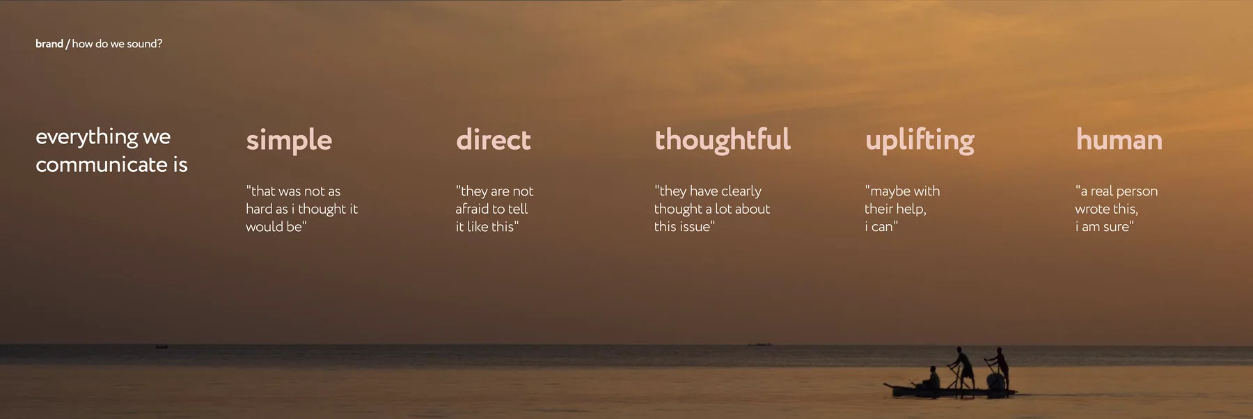
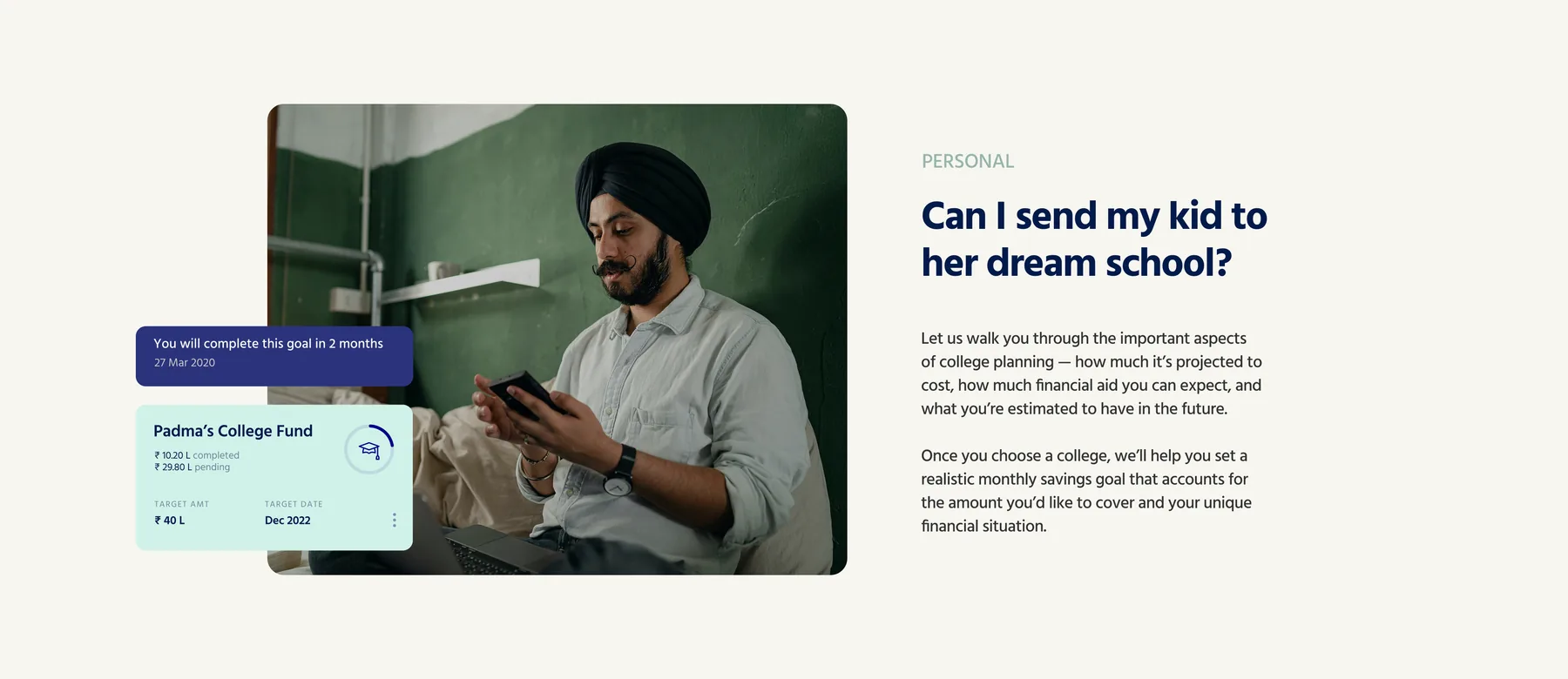
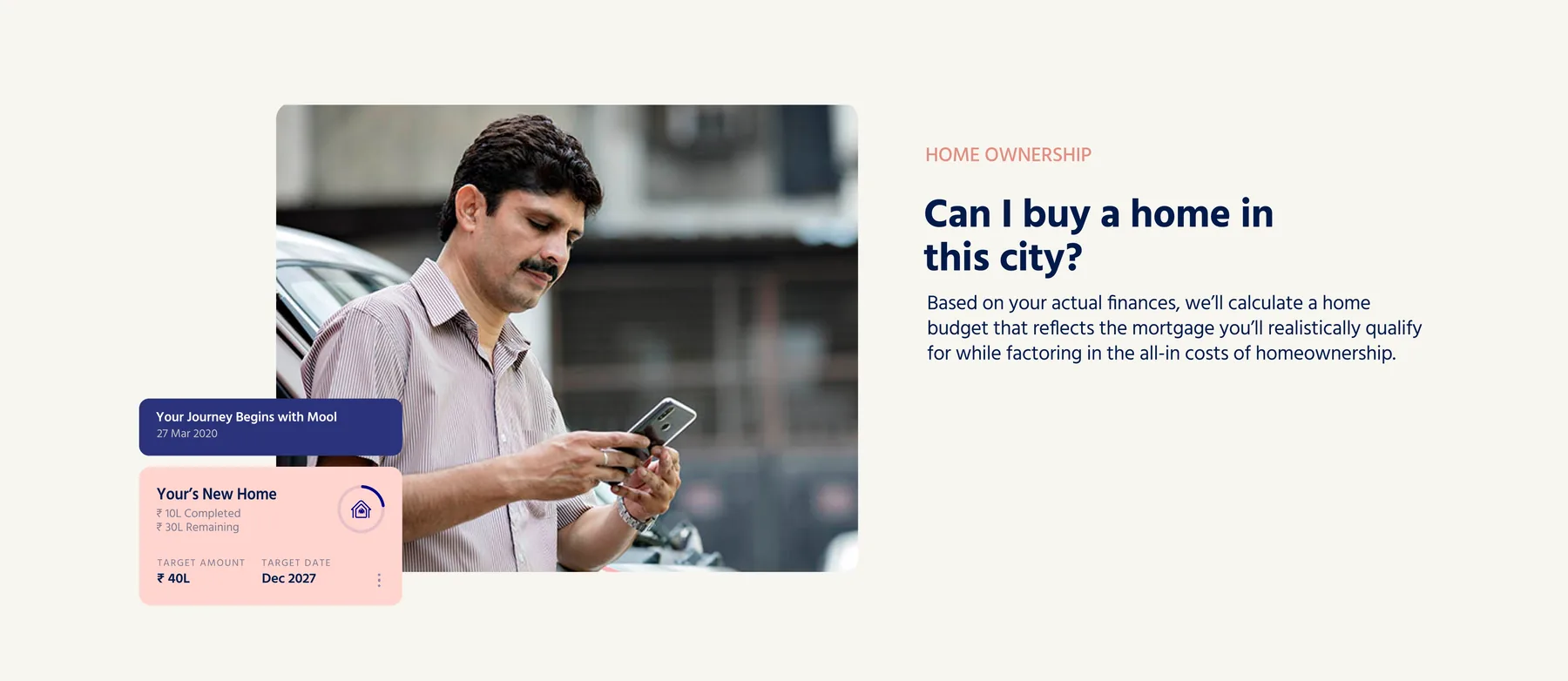
The assumption everyone starts with is that the gap is financial literacy. The harder gap was interface literacy: for a meaningful share of this audience, this was among the first apps they had installed. Flows were built around one decision per screen, explicit confirmation, and no gesture that had to be discovered before it could be used.
TradeoffIt costs experienced users taps. Someone moving money between their own accounts for the twentieth time goes through the same paced flow as someone doing it for the first time, and there is no express path for them.

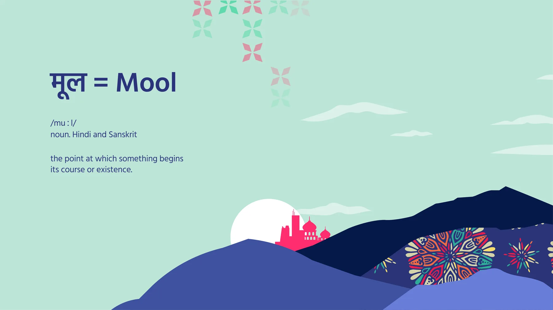
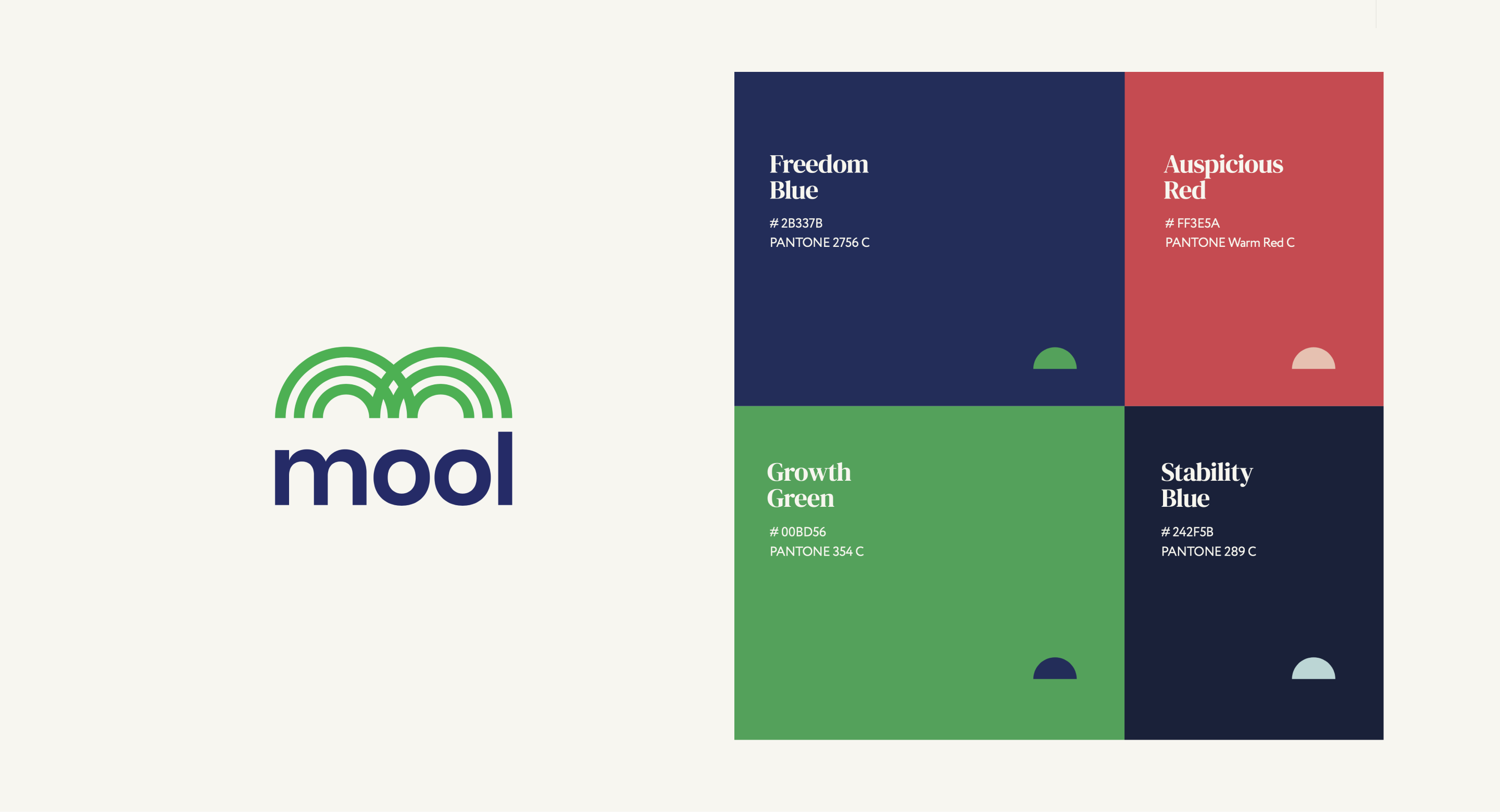
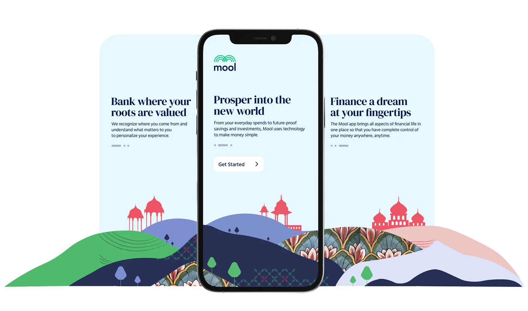
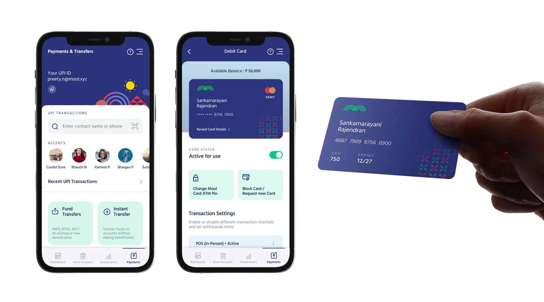
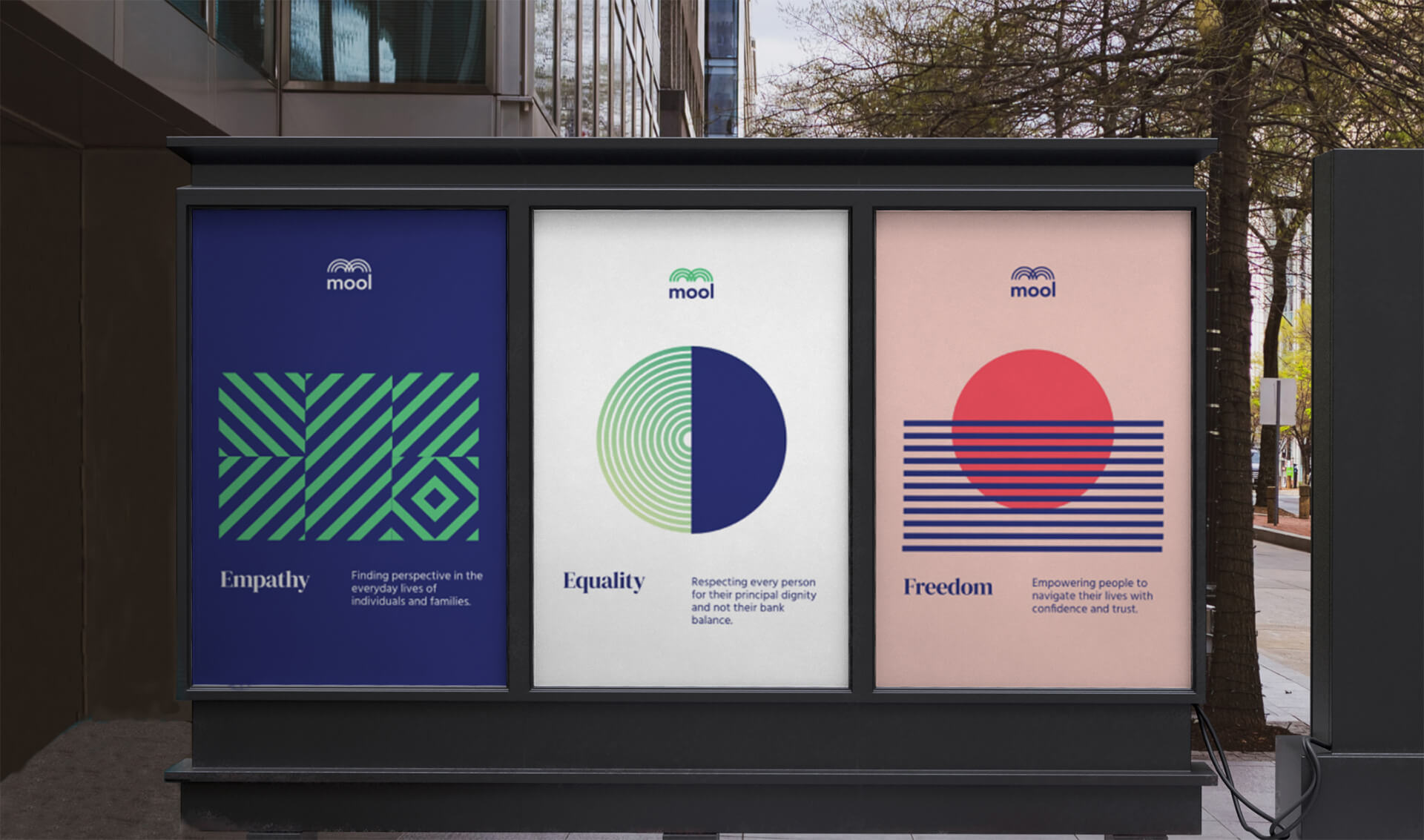

Before Mool I thought accessible meant simpler. This project taught me it really means resonant. People trust an app not because it looks clean but because it feels like it was made by someone who understands their world. We studied Indian folk art, regional patterns, and traditional color palettes not as decoration but as signals of belonging.
Every visual decision was tested against one question: does this make someone from a small town feel like this was built for them. Clarity is emotional, not just functional. A user who feels seen will trust you with their money.